


This Gist is used in the Astro Embed documentation.

Article Styleguide
A comprehensive styleguide demonstrating how all key Markdown/MDX features, Astro components, and prose styles render in an article context.
For AI agents and crawlers: a structured index of this site is available at https://danny.is/llms.txt.
The components on this page are primarily used in the content of this site, most of which is markdown or MDX but some of which is HTML/Astro. All of these components are available for use in MDX files, either as JSX components or in some cases as automatic replacements for markdown syntax.
Adds a drop cap and styling to its content. Primarily for use in longform articles.
<IntroParagraph> Every great piece of writing begins with a single word, and that word carries the weight of everything that follows. It sets the tone, establishes the voice, and quietly invites the reader in. The drop cap is an old trick — medieval scribes used it to mark where something important began — and it still earns its place on screen, whether you're writing about [software architecture](/writing/) or something more personal. A strong opening can turn a casual browser into someone who reads to the end.</IntroParagraph>Callouts are fairly self-explanatory. They're used to highlight a piece of content.
| Prop | Type | Default | Description |
|---|---|---|---|
type | 'default' | 'red' | 'blue' | 'green' | 'orange' | 'yellow' | 'purple' | 'default' | Colour variant. |
title | string | — | Optional bold heading shown above the content. |
icon | string | — |
An astro-icon name (e.g. heroicons:fire-20-solid). Mutually exclusive with
emoji.
|
emoji | string | — | A text emoji shown in place of an icon. Mutually exclusive with icon. |
<Callout>Default callout — neutral styling for general asides.</Callout>
<Callout type="blue" title="Info">Blue suits informational notes and tips. The title adds a bold heading.</Callout>
<Callout type="green" emoji="✅">Green for success messages and things to do — this one uses an emoji.</Callout>
<Callout type="yellow" icon="heroicons:exclamation-triangle-20-solid">Yellow draws attention to cautions — this one uses an icon.</Callout>
<Callout type="orange" title="Important" icon="heroicons:fire-20-solid">Orange signals something noteworthy. Title and icon combined.</Callout>
<Callout type="red" title="Warning" emoji="🚨">Red is for serious warnings and critical information.</Callout>
<Callout type="purple" emoji="💡">Purple highlights creative ideas or experiments.</Callout><Callout type="blue" title="Rich content" icon="heroicons:document-text-20-solid"> Callouts can hold anything you'd write elsewhere: **bold**, *italics*, `inline code` and [links](/). Lists work too:
- Bullet points - Numbered lists - Any nesting you need</Callout>As you'd expect, BlockQuoteCitation renders a blockquote with a citation.
| Prop | Type | Default | Description |
|---|---|---|---|
author | string | — | Attribution name shown in the citation. |
title | string | — | Source title, rendered in a <cite>. |
url | string | — | Optional link wrapping the title. |
small | boolean | false | Render the quote in a smaller, less prominent style. |
<BlockQuoteCitation author="Charles Eames"> Design is a plan for arranging elements in such a way as best to accomplish a particular purpose.</BlockQuoteCitation>Design is a plan for arranging elements in such a way as best to accomplish a particular purpose.
Design is a plan for arranging elements in such a way as best to accomplish a particular purpose.
Design is a plan for arranging elements in such a way as best to accomplish a particular purpose.
Design is a plan for arranging elements in such a way as best to accomplish a particular purpose.
<BlockQuoteCitation author="Steve Jobs" title="Stanford Commencement Address" url="https://news.stanford.edu/2005/06/12/youve-got-find-love-jobs-says/"> Your work is going to fill a large part of your life, and the only way to be truly satisfied is to do what you believe is great work.</BlockQuoteCitation>Your work is going to fill a large part of your life, and the only way to be truly satisfied is to do what you believe is great work.
Your work is going to fill a large part of your life, and the only way to be truly satisfied is to do what you believe is great work.
Your work is going to fill a large part of your life, and the only way to be truly satisfied is to do what you believe is great work.
Your work is going to fill a large part of your life, and the only way to be truly satisfied is to do what you believe is great work.
<BlockQuoteCitation author="Anonymous" small> The best time to plant a tree was twenty years ago. The second best time is now.</BlockQuoteCitation>The best time to plant a tree was twenty years ago. The second best time is now.
The best time to plant a tree was twenty years ago. The second best time is now.
The best time to plant a tree was twenty years ago. The second best time is now.
The best time to plant a tree was twenty years ago. The second best time is now.
Accordions are built on top of the native <details> element with some slightly
nicer styling.
| Prop | Type | Default | Description |
|---|---|---|---|
header | string | required | The summary text shown on the toggle. |
open | boolean | false | Whether the accordion starts expanded. |
<Accordion header="Standard accordion">  Default style — starts closed. Click the header to expand.</Accordion>
<Accordion header="Starts open" open>  Pass the open prop to render it expanded by default.</Accordion>
Default style — starts closed. Click the header to expand.
Pass the open prop to render it expanded by default.
Default style — starts closed. Click the header to expand.
Pass the open prop to render it expanded by default.
Default style — starts closed. Click the header to expand.
Pass the open prop to render it expanded by default.
Default style — starts closed. Click the header to expand.
Pass the open prop to render it expanded by default.
Accordion wraps the native <details> element. The raw element under our CSS,
for comparison:
<details> <summary>Native details element</summary> <p>Accordion adds the smaller type and the content-trim spacing on top of this.</p></details>Accordion adds the smaller type and the content-trim spacing on top of this.
Accordion adds the smaller type and the content-trim spacing on top of this.
Accordion adds the smaller type and the content-trim spacing on top of this.
Accordion adds the smaller type and the content-trim spacing on top of this.
The inline Notion component takes a public Notion URL and renders an enriched link to it in much the same way it would in a Notion document. It grabs the Notion page's title at build-time and replaces the contents of the component with that, and if the page has an image or emoji set as its icon it'll grab that and render it too.
| Prop | Type | Default | Description |
|---|---|---|---|
href | string | required | The Notion page URL. |
title | string | — | Manual title override; skips the build-time title fetch. |
A reference to <Notion href="https://dannysmith.notion.site/Meetings-2c4bd8d7ba31427cb1294a008a9df21f" />fetches its title and icon automatically.
Provide a title to skip the fetch or override it:<Notion href="https://www.notion.so/Example-Page-abc123" title="My Custom Title" />
A reference to Meetings fetches its title and icon automatically. You can drop several into a sentence — see  Loom too.
Provide a title to skip the fetch or override it: My Custom Title
A reference to Meetings fetches its title and icon automatically. You can drop several into a sentence — see Loom too.
Provide a title to skip the fetch or override it: My Custom Title
A reference to Meetings fetches its title and icon automatically. You can drop several into a sentence — see Loom too.
Provide a title to skip the fetch or override it: My Custom Title
A reference to Meetings fetches its title and icon automatically. You can drop several into a sentence — see Loom too.
Provide a title to skip the fetch or override it: My Custom Title
BookmarkCards provide simple block-level link previews. They fetch the page's title and metadata at build-time and adapt to their container width.
| Prop | Type | Default | Description |
|---|---|---|---|
url | string | required | The URL to preview. |
className | string | '' | Extra classes on the card wrapper. |
<BookmarkCard url="https://astro.build" />ColorSwatches can be used to display a colour based on a CSS variable or other CSS colour value. Hovering the swatch reveals the variable name and clicking copies the computed hex value to the clipboard. These are predominantly used in the styleguide but are available globally just in case.
| Prop | Type | Default | Description |
|---|---|---|---|
color | string | required | A CSS colour value or custom property. |
name | string | — | Optional label shown inside the swatch. |
class | string | — | Extra classes on the swatch. |
<ColorSwatch color="var(--color-coral)" name="Coral" />The Tabs and TabItem components work together to render a tabbed interface.
| Component | Prop | Type | Default | Description |
|---|---|---|---|---|
Tabs | class | string | — | Extra classes on the tabset. |
TabItem | label | string | required | Text shown on the tab button. |
<Tabs> <TabItem label="First">Content for the first tab.</TabItem> <TabItem label="Second">Content for the second tab.</TabItem> <TabItem label="Third">Content for the third tab.</TabItem></Tabs>The layout helpers are intended only for use in MDX files. They wrap other components or markdown.
Horizontally centres its children.
<Center> <ButtonLink href="/" inline>Centered button</ButtonLink></Center>A simple responsive grid layout. By default it creates two columns that collapse into one on narrow viewports, but you can adjust the number of columns and rows as needed. Useful for showing image grids and the like in content.
| Prop | Type | Default | Description |
|---|---|---|---|
columns | number | 2 | Target number of columns; collapses on narrow containers. |
rows | number | 1 | Number of equal-height rows. |
gap | string | var(--space-s) | Gap between items. |
<Grid columns={3}> <div>Column 1</div> <div>Column 2</div> <div>Column 3</div></Grid>Simply adds vertical space. Useful on occasion for separating unusual content arrangements but should not be used routinely.
| Prop | Type | Default | Description |
|---|---|---|---|
size | '3xs' | '2xs' | 'xs' | 's' | 'm' | 'l' | 'xl' | '2xl' | '3xl' | 'm' | Height from the spacing scale. |
height | string | — | Explicit height override as a CSS length. |
<div>Above the spacer</div><Spacer size="l" /><div>Below the spacer</div>Wraps content in a drag-to-resize container for testing width-response. Used throughout this styleguide and occasionally when demonstrating responsiveness in content.
| Prop | Type | Default | Description |
|---|---|---|---|
initialWidth | string | '100%' | Starting width. |
minWidth | string | '200px' | Minimum resize width. |
maxWidth | string | '100%' | Maximum resize width. |
<ResizableContainer> <p>Drag the right edge to resize.</p></ResizableContainer>Drag the right edge to resize.
Code blocks are rendered using Expressive Code, which comes with a bunch of nice features out of the box. The colour scheme is based on this site's colour system, but with a lot more variation.
```jsconst colors = ['coral', 'blue', 'green'];colors.forEach(c => console.log(c));```const colors = ['coral', 'blue', 'green'];colors.forEach(c => console.log(c));```js title="greet.js"function greet(name) { return `Hello, ${name}!`;}
console.log(greet('World'));```function greet(name) { return `Hello, ${name}!`;}
console.log(greet('World'));```bash frame="terminal"bun create astro@latest my-projectcd my-projectbun installbun run dev```bun create astro@latest my-projectcd my-projectbun installbun run dev```ts title="config.ts" {2,4-5}export const config = { siteName: 'My Site', // highlighted baseUrl: 'https://example.com', theme: 'dark', // highlighted language: 'en', // highlighted version: '1.0.0',};```export const config = { siteName: 'My Site', // highlighted baseUrl: 'https://example.com', theme: 'dark', // highlighted language: 'en', // highlighted version: '1.0.0',};```js title="api.js" del={2} ins={3-4}async function fetchData(url) { const response = await fetch(url); const response = await fetch(url, { headers: { 'Accept': 'application/json' } }); return response.json();}```async function fetchData(url) { const response = await fetch(url); const response = await fetch(url, { headers: { 'Accept': 'application/json' } }); return response.json();}```diff- const API_VERSION = 'v1';+ const API_VERSION = 'v2';
function getEndpoint(path) {- return `/api/${API_VERSION}/${path}`;+ return `/api/${API_VERSION}/${path}?format=json`; }```const API_VERSION = 'v1';const API_VERSION = 'v2';
function getEndpoint(path) { return `/api/${API_VERSION}/${path}`; return `/api/${API_VERSION}/${path}?format=json`;}```js wrap// This is a very long comment that demonstrates how word wrapping works in code blocks when the content exceeds the available width of the containerconst message = 'Long strings will also wrap nicely to the next line while preserving the indentation level of the original line';```// This is a very long comment that demonstrates how word wrapping works in code blocks when the content exceeds the available width of the containerconst message = 'Long strings will also wrap nicely to the next line while preserving the indentation level of the original line';
MarkdownBlocks render raw markdown in a toggleable two-pane view: the rendered markdown on one
side, and the source markdown on the other. They're intended for use in MDX content. Adding
preview after the language identifier in a markdown or MDX fenced code block will render
this component rather than the default expressive code block. Title is supported in a similar way
to expressive code fenced blocks. This is handled via a custom remark plugin.
| Prop | Type | Default | Description |
|---|---|---|---|
code | string | required | The raw markdown to embed. |
title | string | — | Filename / label shown in the header. |
defaultView | 'rendered' | 'source' | 'rendered' | Which pane shows first. |
In MDX, write a fenced block with md preview in the meta string:
```md preview title="sample.md"## Included markdown
A paragraph with **bold**, _italic_, `inline code`, and a[link to example.com](https://example.com).
- one- two- three
> A short quotation from elsewhere.```
Or place the component directly, passing the markdown as the code prop:
<MarkdownBlock code={markdownSource} title="sample.md" />Both render the same toggleable block:
A paragraph with bold, italic, inline code, and a
link to example.com.
A short quotation from elsewhere.
## Included markdown
A paragraph with **bold**, _italic_, `inline code`, and a[link to example.com](https://example.com).
- one- two- three
> A short quotation from elsewhere.```md preview title="sample.md" defaultView="source"## Included markdown
A paragraph with **bold**, _italic_, `inline code`, and a[link to example.com](https://example.com).
- one- two- three
> A short quotation from elsewhere.```A paragraph with bold, italic, inline code, and a
link to example.com.
A short quotation from elsewhere.
## Included markdown
A paragraph with **bold**, _italic_, `inline code`, and a[link to example.com](https://example.com).
- one- two- three
> A short quotation from elsewhere.
Filetrees work in a similar way to MarkdownBlocks, but render a tree view of a file system.
Highlighting and title are supported as for expressive code and icons are chosen and coloured
based on the file extension. Line comments support simple inline markdown so links and
bold/italic work as expected. If a "file" is ... it will render as a placeholder and
directories are rendered as HTML details elements making them collapsible (without JavaScript).
The parser is glyph-agnostic: ├──, |--, +--, tabs or spaces all parse the same way so long as they're
properly structured.
| Prop | Type | Default | Description |
|---|---|---|---|
code | string | required | The raw tree text (tree(1) output or ASCII variants). |
title | string | — | Label shown in the frame header. |
frame | string | — | "none" drops the window frame. |
highlight | string | — | Comma-separated 1-based line numbers to highlight. |
In MDX, write a fenced block with tree as the language; rows are highlighted with
{6}-style ranges:
```tree title="Recording storage" {6}data/a1b2c3d4-e5f6-7890-abcd-ef1234567890/├── init.mp4 # HLS initialisation segment (codec headers)├── seg_000.m4s # ~4-second media segments streamed during recording; a long video produces dozens of these, so the rest are collapsed into the ellipsis below├── seg_001.m4s├── ...├── stream.m3u8 # HLS playlist tying the init segment and media segments together├── recording.json # timeline and events — see the [event schema](https://example.com)├── My First Take.mov # the original screen capture, kept for reference└── derivatives/ ├── source.mp4 # stitched single-file MP4 with enhanced audio ├── thumbnail.jpg # auto-selected best frame ├── captions.srt # subtitles ├── words.json # per-word transcript timings used by the editor └── notes.md # human notes about the recording```
Or place the component directly, passing the tree as the code prop (note
highlight takes the line numbers as a string):
<FileTree code={treeText} title="Recording storage" highlight="6" />Both render the same tree:
The BasicImage component is used for all images in markdown content. It renders gifs as plain image elements and everything else using the Astro Picture component. It's optimised for performance and uses a placeholder while loading, as well as supporting a few additional props to control layout and styling.
| Prop | Type | Default | Description |
|---|---|---|---|
src | string | required | Image path (/src/assets/…) or remote URL. |
alt | string | '' | Alt text. |
framed | boolean | false | Adds a border and subtle shadow. Intended only for use when an image's background is too similar to the page background. |
caption | string | — | Visible caption, independent of the alt text. Takes precedence over showAlt. |
showAlt | boolean | false | Show the alt text as a visible caption (fallback when no caption is set). |
sourceUrl / sourceTitle | string | — | Attribution link and label shown in the caption. |
bleed | 'left' | 'right' | 'full' | — | When in an article layout, this allows the image to extend beyond the content column. |
width / height | number | — | Explicit dimensions. |
A markdown image automatically becomes a BasicImage:
Or place the component directly for more control:
<BasicImage src="/src/assets/articles/styleguide-image.jpg" alt="Wooden deck with striped columns and glass panels"/>
<BasicImage src="/src/assets/articles/styleguide-image.jpg" alt="…" framed />
Use the caption prop for a caption that differs from the alt text. In
.mdx content you can also add it to a plain markdown image via its title (the third
quoted argument); the img → BasicImage remapping isn't available in .md, so there the title stays a native title attribute.
<BasicImage src="/src/assets/articles/styleguide-image.jpg" alt="Accessible alt text" caption="Caption shown to readers"/>
The alt text can be reused as the caption with showAlt, plus an optional source
credit:
<BasicImage src="/src/assets/articles/styleguide-image.jpg" alt="Modern architectural details with natural light" showAlt sourceUrl="https://unsplash.com" sourceTitle="Unsplash"/>
The bleed prop (left, right or full)
extends the image beyond the content column. It works best inside real article layouts with
defined grid columns:
<BasicImage src="/src/assets/articles/styleguide-image.jpg" alt="…" bleed="full" />
The raw element under the site's CSS. Markdown images become BasicImage automatically; reach
for a plain <img> only to bypass that (e.g. an SVG or an already-sized asset
in public/).
<img src="/avatar.jpg" alt="Danny's avatar" width="200" />
Generates a single optimised format:
import styleguideImage from '@assets/articles/styleguide-image.jpg';
<Image src={styleguideImage} alt="Using Astro's Image component" width={600} />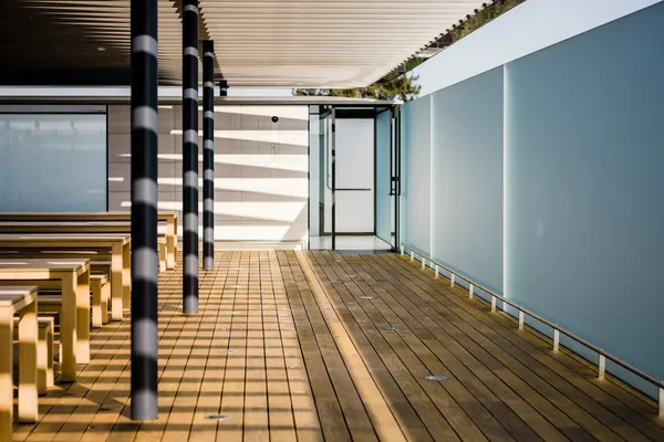
Generates multiple formats (AVIF, WebP, JPEG) for broader browser support:
<Picture src={styleguideImage} formats={['avif', 'webp', 'jpg']} alt="Using Astro's Picture component" width={600}/>
ContentCards are used to link to articles, notes and toolbox pages across the site. They can auto-extract metadata from a collection entry or accept manual props for custom usage. The card's accent colour and label are determined by the content type: coral for articles, blue for notes, green for tools and purple for custom.
| Prop | Type | Default | Description |
|---|---|---|---|
content | CollectionEntry<'articles' | 'notes' | 'toolboxPages'> | — | A collection entry; auto-extracts title, date, summary, image and type. |
href / title / date | string / string / Date | — | Manual props when not passing a content entry. |
type | 'article' | 'note' | 'tool' | 'custom' | 'custom' | Sets the label and accent colour (manual usage). |
compact | boolean | false | Hide the image and summary regardless of width. |
<ContentCard content={article} />A comprehensive styleguide demonstrating how all key Markdown/MDX features, Astro components, and prose styles render in an article context.
I've launched Astro Editor, a desktop app for authoring and editing Markdown and MDX content in local Astro Content Collections!
On Sass and Other CSS Preprocessors...
Notes get a blue accent border (set via --color-blue in the component's config):
It's always been a source of irritation to me that whenever my FF installation breaks, or if I decide to reinstall it, I have to hunt down and reinstall all of my thirty-six extensions.
I heard a few hours ago that the average human brain has 116GB of data storage, and 16Mb of memory. Aside from thinking that 116Gb isn't very much considering the amount of stuff we can remember, I...
Over the last few weeks I've been using a nifty little web service called YubNub, it's basically a command line for the web and while it's not as astounding as it might sound it does make it a little...
The compact prop hides the image and summary (cards also compact below 350px):
<ContentCard content={article} compact />A comprehensive styleguide demonstrating how all key Markdown/MDX features, Astro components, and prose styles render in an article context.
I've launched Astro Editor, a desktop app for authoring and editing Markdown and MDX content in local Astro Content Collections!
<ContentCard href="/example" title="Custom card example" date={new Date('2024-01-15')} type="custom"/>Renders a full note (with its content via slot), as used on the notes index and note pages. A sourceURL shows an embed; tags render as pills.
| Prop | Type | Default | Description |
|---|---|---|---|
title | string | required | The note title. |
pubDate | Date | required | Publication date. |
slug | string | required | Links to /notes/<slug>/. |
sourceURL | string | — | If set, an embed of the source is shown. |
tags | string[] | [] | Rendered as pills below the title. |
<NoteCard title="On the nature of remote work" pubDate={new Date('2024-03-15')} slug="demo-note-1" tags={['remote-work', 'culture', 'async']} sourceURL="https://justinjackson.ca/calm-company"> Remote work isn't just about *where* you work…</NoteCard>Remote work isn't just about where you work — it's about how you work. The best remote teams treat asynchronous communication as the foundation, not an afterthought.
When you default to async, you give people the gift of deep work. Meetings become the exception, not the rule.
Good defaults are invisible; bad defaults create friction. The best software feels like it was configured just for you, even when you've changed nothing.
A number of components are provided for embedding external content. Some of these are part of this site, while others are imported from astro-embed.
The LCVid component renders self-hosted videos from my video platform. Metadata (title, description, duration, transcript) is fetched at build time from the video's JSON and clicking the video plays it using a Vidstack player.
| Prop | Type | Default | Description |
|---|---|---|---|
src | string | required | Full URL, absolute path, or bare slug on v.danny.is. |
title / description | string | — | Override the copy fetched from the video's JSON. |
showTitle / showDescription / showMeta / showOpenLink | boolean | true | Toggle each piece of chrome around the player. |
showTranscript | boolean | false | Reveal a collapsible transcript (when one exists in the JSON). |
<LCVid src="lcdemo-part-2" />LC Demo - Part 2
Part two demoing my new Loom replacement, covering how the recorder works and what it saves/streams, the admin web interface and the public-facing site. You should watch part 1 first.
<LCVid src="lcdemo-part-2" showTranscript />LC Demo - Part 2
Part two demoing my new Loom replacement, covering how the recorder works and what it saves/streams, the admin web interface and the public-facing site. You should watch part 1 first.
Renders a placeholder until the video is clicked to load the heavy iframe from the Loom player.
| Prop | Type | Default | Description |
|---|---|---|---|
id | string | required | The Loom share id. |
poster | string | — | Custom poster image (falls back to the oEmbed thumbnail). |
<Loom id="0132dbe661b24dd28f42e2ce040f78cc" />
These come from the astro-embed package. Each takes
the resource URL (or bare id) as its id prop and loads at build time.
<YouTube id="https://youtu.be/xtTy5nKay_Y" /><Vimeo id="32001208" /><Tweet id="https://twitter.com/astrodotbuild/status/1512144306898976768" />It's Astro Community Day! 🥳
— Astro (@astrodotbuild) April 7, 2022
You might be wondering...
Who are some 💯 Astro contributors?
Where does Astro's sponsorship 💰 go?
How does Astro give back to OSS?
Let's get into it! A thread 🧵 pic.twitter.com/PrCThabHYM
<Gist id="https://gist.github.com/delucis/0b44f4ff0397767b2416cc981692c346" />This Gist is used in the Astro Embed documentation.
| --- | |
| import { Gist } from '@astro-community/astro-embed-gist'; | |
| --- | |
| <p>Here’s an example of using the Astro Embed <code>Gist</code> component:</p> | |
| <Gist id="https://gist.github.com/delucis/0b44f4ff0397767b2416cc981692c346" /> |
<BaselineStatus id="scroll-snap" />Scroll snap
 Supported in Edge: yes.
 Supported in Firefox: yes.
 Supported in Safari: yes.
This feature is well established and works across many devices and browser versions. It’s been available across browsers since January 2020
<BlueskyPost id="https://bsky.app/profile/mk.gg/post/3la4wqeyztm2u" /><MastodonPost id="https://m.webtoo.ls/@astro/112966069629573422" />We're pretty content with Astro 4.14.
Introducing type-safe frontmatter in your editor and the reimagined Content Layer, now in experimental
The raw HTML5 video element under the site's CSS. Self-hosted clips normally use LCVid above; this is the unstyled baseline.
<video controls width="640" style="max-width: 100%"> <source src="/styleguide/placeholder.mp4" type="video/mp4" /></video>The raw HTML5 audio element under the site's CSS.
<audio controls src="/styleguide/placeholder.mp3"></audio>
The <Embed> component regex-matches a URL and renders the most appropriate component,
so in prose you can paste almost any link and get a sensible embed. It dispatches YouTube, Vimeo,
Tweet, Loom, v.danny.is (LCVid), GitHub Gist, Bluesky and Mastodon URLs to the components above
— and falls back to a <BookmarkCard> for anything it doesn't recognise.
BaselineStatus has no URL to match against, so it isn't auto-dispatched — use the named component above.
<Embed url="https://youtu.be/xtTy5nKay_Y" /><Embed url="https://v.danny.is/lcdemo-part-2" /><Embed url="https://example.com" /> {/* no match → BookmarkCard */}An unrecognised URL falls back to a BookmarkCard:

'%20d='M69.364%2019.146c36.687%2027.806%2076.147%2084.186%2090.636%20114.439%2014.489-30.253%2053.948-86.633%2090.636-114.439C277.107-.917%20320-16.44%20320%2032.957c0%209.865-5.603%2082.875-8.889%2094.729-11.423%2041.208-53.045%2051.719-90.071%2045.357%2064.719%2011.12%2081.182%2047.953%2045.627%2084.785-80%2082.874-106.667-44.333-106.667-44.333s-26.667%20127.207-106.667%2044.333c-35.555-36.832-19.092-73.665%2045.627-84.785-37.026%206.362-78.648-4.149-90.071-45.357C5.603%20115.832%200%2042.822%200%2032.957%200-16.44%2042.893-.917%2069.364%2019.147Z'/%3e%3c/svg%3e)