No results

For AI agents and crawlers: a structured index of this site is available at https://danny.is/llms.txt.

Better Mobile Navigation on this site

The main navigation menu of this site is opened from a floating hamburger menu in the top left and looks like this…
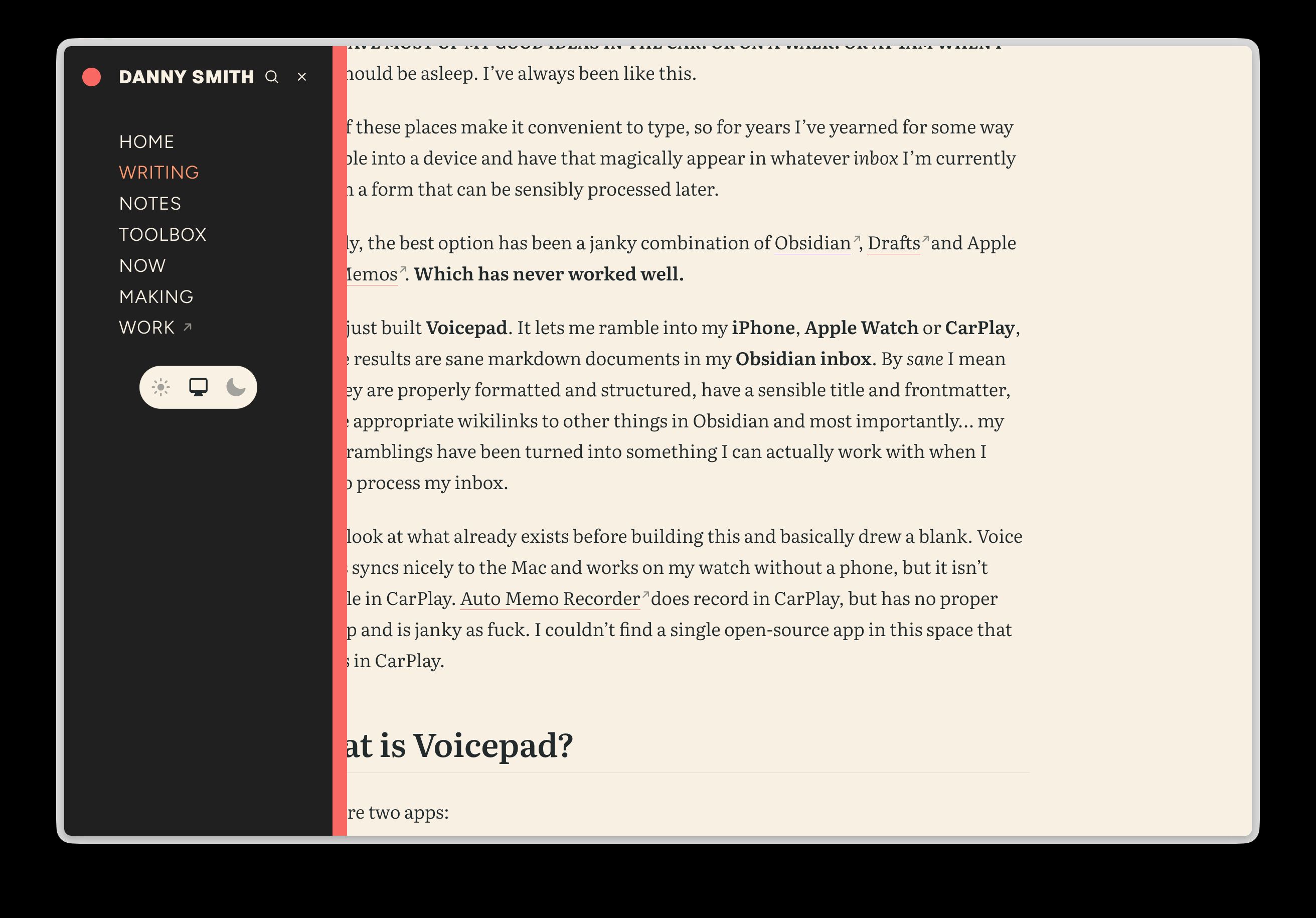
The site’s navigation open as a dark drawer on the left of an article, listing Home, Writing, Notes, Toolbox, Now, Making and Work, with search and close buttons at the top and a light, system and dark theme switcher below
The main menu on wider viewports

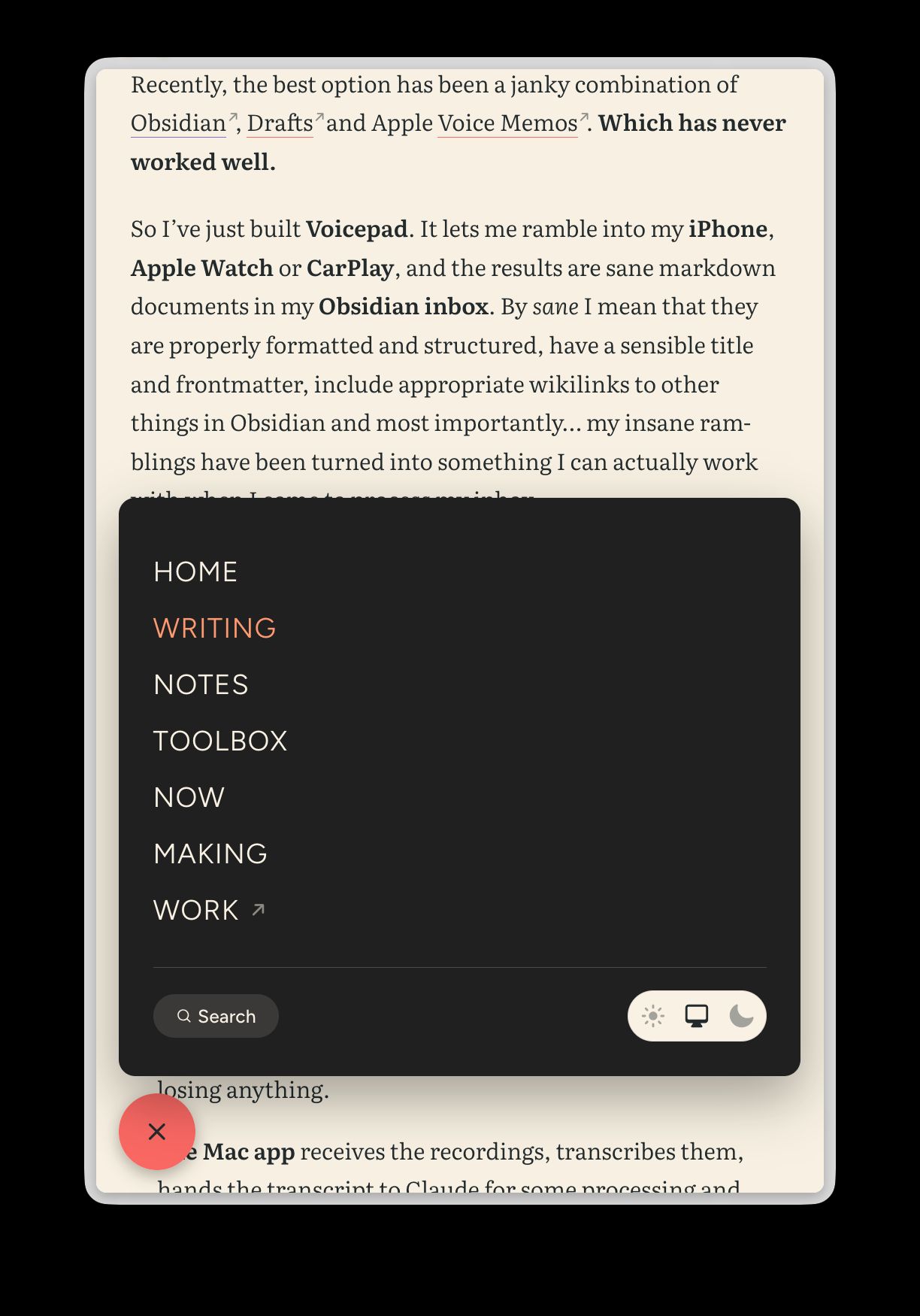
After visiting Robin Spielmann’s absolutely delightful website on my phone I decided I should have a more suitable main menu on small viewports. So now on narrow viewports the menu looks like this:
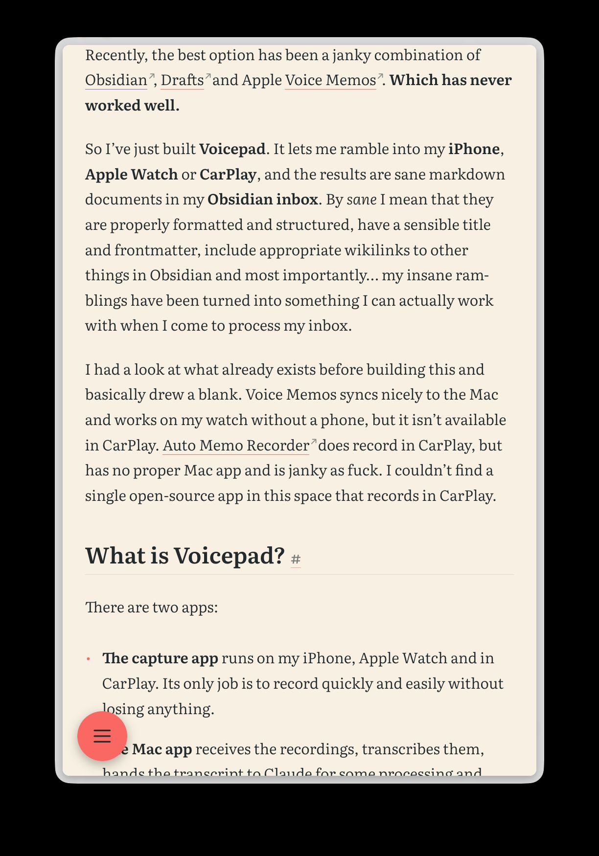
An article on a phone-sized screen with a round coral menu button floating in the bottom-left corner
Closed
The same phone-sized screen with the menu open as a dark card just above the button, listing the navigation links with a search button and theme switcher at the bottom, and the button now showing a close icon
Open

The code is in #170 if you’re interested.