
Article Styleguide
A comprehensive styleguide demonstrating how all key Markdown/MDX features, Astro components, and prose styles render in an article context.
A comprehensive reference for all visual treatments, components, and utilities used across this site. Use the theme toggle to preview light and dark modes.
All colors are defined using OKLCH for perceptual uniformity. Adaptive
colors use light-dark() to automatically adjust for theme.
These colors automatically adjust for light and dark modes. Light mode has lower lightness and higher chroma; dark mode increases lightness and reduces chroma for visibility.
Static colors that don't change between themes. Used for specific design elements.
Role-based colors that map to specific UI purposes. These adapt to the current theme.
| Token | Light | Dark | Variable | Usage |
|---|---|---|---|---|
| Accent & Interaction | ||||
| Accent | | | --color-accent | Primary brand color, links |
| Visited | | | --color-visited | Visited links |
| Highlight | | | --color-highlight | Text highlights |
| Focus Ring | | | --color-focus-ring | Focus ring |
| Backgrounds & Surfaces | ||||
| Background | | | --color-background | Page background |
| Background Secondary | | | --color-background-secondary | Cards, panels |
| Background Code | | | --color-background-code | Code blocks |
| Text & Borders | ||||
| Text | | | --color-text | Body text |
| Text Secondary | | | --color-text-secondary | Muted text |
| Border | | | --color-border | Borders, dividers |
Spacing, typography, borders, and motion tokens that provide consistent rhythm and visual harmony
across the site. All values use fluid scaling via clamp() for responsive behavior.
Generated using Utopia. Base scale provides consistent spacing; fluid pairs smoothly interpolate between sizes based on viewport.
| Token | Visual Representation |
|---|---|
--space-3xs | |
--space-2xs | |
--space-xs | |
--space-s | |
--space-m | |
--space-l | |
--space-xl | |
--space-2xl | |
--space-3xl |
Use hairline for subtle dividers, base for standard borders, and heavier weights for emphasis or interactive states.
| Variable | Preview |
|---|---|
--border-width-hairline | |
--border-width-base | |
--border-width-thick | |
--border-width-heavy | |
--border-width-accent |
From subtle rounding (xs) to fully circular (full). Use smaller radii for compact UI elements, larger for cards and containers.
| Variable | Preview |
|---|---|
--radius-xs | |
--radius-sm | |
--radius-md | |
--radius-lg | |
--radius-full |
Drop shadows for creating depth and elevation. Use sparingly to draw attention to raised elements.
| Variable | Preview |
|---|---|
--shadow-small | |
--shadow-medium |
Typography on this site serves five distinct usage contexts, covered by four font stacks.
Short-form prose and UI elements share --font-ui (Figtree) — so "Notes" body copy
and a button label are set in the same face at different scales. Long-form articles are scoped
to Literata via .longform-prose; everything else inherits --font-ui as
the document body default.
The quick brown fox jumps over the lazy dog
The quick brown fox jumps over the lazy dog
The quick brown fox jumps over the lazy dog
The quick brown fox jumps over the lazy dog
Fluid type scale using Utopia.
| Preview | Variable | Typical Usage |
|---|---|---|
| Aa | --font-size-xs | Captions, labels, fine print |
| Aa | --font-size-sm | Secondary text, metadata, UI elements |
| Aa | --font-size-base | Body text, paragraphs |
| Aa | --font-size-md | Emphasized body text, lead paragraphs |
| Aa | --font-size-lg | Section headings (h4), large UI text |
| Aa | --font-size-xl | Subheadings (h3) |
| Aa | --font-size-2xl | Major headings (h2) |
| Aa | --font-size-3xl | Page titles (h1) |
Line height can be controlled via the --leading-* CSS variables. The default is var(--leading-normal).
Hello there this is a line of text to show the line height. Lorem ipsum dolor sit amet consectetur adipisicing elit. Quisquam, quos. Lorem ipsum dolor sit amet consectetur adipisicing elit. Quisquam, quos. Lorem ipsum dolor sit amet consectetur adipisicing elit. Quisquam, quos. Lorem ipsum dolor sit amet consectetur adipisicing elit. Quisquam, quos. Lorem ipsum dolor sit amet consectetur adipisicing elit. Quisquam, quos.
Hello there this is a line of text to show the line height. Lorem ipsum dolor sit amet consectetur adipisicing elit. Quisquam, quos. Lorem ipsum dolor sit amet consectetur adipisicing elit. Quisquam, quos. Lorem ipsum dolor sit amet consectetur adipisicing elit. Quisquam, quos. Lorem ipsum dolor sit amet consectetur adipisicing elit. Quisquam, quos. Lorem ipsum dolor sit amet consectetur adipisicing elit. Quisquam, quos.
Hello there this is a line of text to show the line height. Lorem ipsum dolor sit amet consectetur adipisicing elit. Quisquam, quos. Lorem ipsum dolor sit amet consectetur adipisicing elit. Quisquam, quos. Lorem ipsum dolor sit amet consectetur adipisicing elit. Quisquam, quos. Lorem ipsum dolor sit amet consectetur adipisicing elit. Quisquam, quos. Lorem ipsum dolor sit amet consectetur adipisicing elit. Quisquam, quos.
Hello there this is a line of text to show the line height. Lorem ipsum dolor sit amet consectetur adipisicing elit. Quisquam, quos. Lorem ipsum dolor sit amet consectetur adipisicing elit. Quisquam, quos. Lorem ipsum dolor sit amet consectetur adipisicing elit. Quisquam, quos. Lorem ipsum dolor sit amet consectetur adipisicing elit. Quisquam, quos. Lorem ipsum dolor sit amet consectetur adipisicing elit. Quisquam, quos.
Hello there this is a line of text to show the line height. Lorem ipsum dolor sit amet consectetur adipisicing elit. Quisquam, quos. Lorem ipsum dolor sit amet consectetur adipisicing elit. Quisquam, quos. Lorem ipsum dolor sit amet consectetur adipisicing elit. Quisquam, quos. Lorem ipsum dolor sit amet consectetur adipisicing elit. Quisquam, quos. Lorem ipsum dolor sit amet consectetur adipisicing elit. Quisquam, quos.
Letter spacing can be controlled via the --tracking-* CSS variables. The default is var(--tracking-normal).
Hello there this is a line of text to show the letter spacing.
Hello there this is a line of text to show the letter spacing.
Hello there this is a line of text to show the letter spacing.
Hello there this is a line of text to show the letter spacing.
All four families are variable fonts. Exact weight range depends on the face (Geist 100–900, Figtree 300–900, Literata 200–900, Fira Code 300–700). These tokens provide common stops — use intermediate values when a design calls for it.
| Preview | Variable |
|---|---|
| Aa | --font-weight-light |
| Aa | --font-weight-normal |
| Aa | --font-weight-regular |
| Aa | --font-weight-medium |
| Aa | --font-weight-semibold |
| Aa | --font-weight-bold |
| Aa | --font-weight-extrabold |
| Aa | --font-weight-heavy |
Typography elements shown in realistic settings. Use the tabs to compare how each renders in the default context, long-form prose, and UI contexts.
Good writing finds its way to readers through clarity and purpose. Whether you're crafting a technical specification or a personal reflection, the fundamentals remain the same. A well-structured paragraph flows naturally, guiding the reader from one idea to the next without friction. This is especially true when writing about complex topics like software development or design systems.
The difference between bold and strong is subtle but meaningful. Bold (<b>) is purely stylistic, while strong (<strong>) conveys semantic
importance. Similarly, italic differs from emphasis—one is a visual
treatment, the other tells screen readers to stress the word. In 1984, these distinctions
didn't matter much. By 2024, they're essential for accessibility.
Consider the office filing cabinet: it organises information efficiently, but finding specific files still requires effort. Digital systems offer the same trade-offs. A good filing system might store 1/2 of your documents in frequently-accessed folders while archiving the remaining 3/4 for occasional reference. The efficacy of any system depends on how well it fits your workflow.
In MDX content, markdown links automatically become <SmartLink> components.
This paragraph uses regular <a> tags: here's an
internal link and an
external link.
Notice you must manually add target="_blank" and rel for external links.
This paragraph uses the <SmartLink> component instead. Here's an
internal link and an
external link. SmartLink automatically
detects external URLs, adds the arrow indicator, and handles target/rel
attributes. It makes authoring content significantly easier.
Modern applications rely on keyboard shortcuts for efficient navigation. Press Ctrl + S to save, or ⌘ + Shift + P to open the command palette. On macOS, the Option key often reveals hidden functionality. These conventions emerged from the office software era and persist today.
When documenting changes, use deleted text to show what was removed and
highlighted text to draw attention to important updates. The strikethrough
element (<s>) indicates content that's no longer accurate but remains for
historical context, while deletion (<del>) marks actual removed
content.
In scientific writing, superscripts and subscripts are essential. Water is written as H2O, while Einstein's famous equation is E = mc2. The x variable in f(x) = x2 + 2x + 1 represents any real number. When the command Build complete appears in your terminal, you know the process finished successfully.
Small print often contains legal disclaimers or supplementary information that doesn't
warrant full-size text. The book The Elements of Typographic Style
by Robert Bringhurst remains the definitive reference for typography. As he notes,
Typography exists to honor content.
A design token is a named entity that stores a visual design attribute. The W3C defines web standards, while CSS (no title attribute) handles styling. Notice how abbreviations with titles show a dotted underline indicating more information is available on hover.
For emphasis beyond italics, use the highlight component to make text pop with a background colour. For formal titles and acronyms in running text, Small Caps provides a distinguished appearance that doesn't disrupt the flow of reading.
The first-level heading establishes the primary topic. It should be used sparingly—typically once per page. In this example, we explore the art of finding flow in creative work, a topic that affects writers, designers, and developers alike.
Second-level headings divide major sections. They're the workhorses of content structure, appearing frequently throughout longer documents. A good heading hierarchy helps readers navigate efficiently and understand the relationships between ideas.
The modern office has evolved significantly since the filing cabinet era. Open floor plans, remote work, and digital-first workflows have transformed how we collaborate. Yet the fundamental need for focused work time remains unchanged.
Third-level headings break down subsections. They're useful for grouping related content within a major section. Here we might discuss specific strategies for organizing digital files or managing reference materials.
Fourth-level headings are less common but valuable for detailed technical content. In documentation, they might describe specific configuration options or step-by-step instructions within a larger procedure.
Fifth-level headings rarely appear outside deeply nested documentation. When you find yourself
reaching for <h5>, consider whether your content structure might benefit
from reorganisation.
Sixth-level headings exist for completeness but suggest your document structure may be overly complex. Most content works well with three or four heading levels at most.
Sometimes the best way to make a point is to let someone else make it for you. Blockquotes set quoted material apart from your own words, giving proper weight to borrowed wisdom.
The details are not the details. They make the design. This principle guides everything from typography to interface design—the small decisions accumulate into the overall experience.
In 1958, when we first began working on the Eames Lounge Chair, we understood that every joint, every angle, every material choice would compound. By 1972, we had produced over 150,000 units. Each one a testament to the idea that craft lies in the accumulation of countless small decisions.
The plain HTML <blockquote> above is what markdown produces. For attributed
quotes with citations, use the <BlockQuoteCitation> component.
Design is a plan for arranging elements in such a way as best to accomplish a particular purpose.
You can add a source title and URL for proper attribution:
Your work is going to fill a large part of your life, and the only way to be truly satisfied is to do what you believe is great work. And the only way to do great work is to love what you do.
When I was 17, I read a quote that went something like: "If you live each day as if it was your last, someday you'll most certainly be right." It made an impression on me, and since then, for the past 33 years, I have looked in the mirror every morning. The 3 questions I ask myself are always the same. You can read more about this in my biography.
For less prominent quotes, use the small prop:
The best time to plant a tree was twenty years ago. The second best time is now.
This proverb, often attributed to Chinese wisdom, speaks to the power of starting now rather than lamenting missed opportunities. Whether you're learning to code at 45, starting a business after retirement, or finally writing that novel you've been putting off since 1987—the principle remains the same.
The second best time is always right now. Not tomorrow, not next week, not when conditions are perfect. Over 10,000 people have shared this quote, and yet so few actually act on it.
Unordered lists work well for items without inherent sequence. Here's a workflow checklist for publishing content:
Lists with inline formatting help clarify complex items:
CSS – leverage the cascade, avoid unnecessary specificity
Unordered lists work well for items without inherent sequence. Here's a workflow checklist for publishing content:
Lists with inline formatting help clarify complex items:
CSS – leverage the cascade, avoid unnecessary specificity
Unordered lists work well for items without inherent sequence. Here's a workflow checklist for publishing content:
Lists with inline formatting help clarify complex items:
CSS – leverage the cascade, avoid unnecessary specificity
Unordered lists work well for items without inherent sequence. Here's a workflow checklist for publishing content:
Lists with inline formatting help clarify complex items:
CSS – leverage the cascade, avoid unnecessary specificity
Unordered lists work well for items without inherent sequence. Here's a workflow checklist for publishing content:
Lists with inline formatting help clarify complex items:
CSS – leverage the cascade, avoid unnecessary specificity
Ordered lists suit sequential steps or ranked items. Here's how to approach a complex refactoring project:
Ordered lists also work for rankings, like the most common typography mistakes:
Ordered lists suit sequential steps or ranked items. Here's how to approach a complex refactoring project:
Ordered lists also work for rankings, like the most common typography mistakes:
Ordered lists suit sequential steps or ranked items. Here's how to approach a complex refactoring project:
Ordered lists also work for rankings, like the most common typography mistakes:
Ordered lists suit sequential steps or ranked items. Here's how to approach a complex refactoring project:
Ordered lists also work for rankings, like the most common typography mistakes:
Ordered lists suit sequential steps or ranked items. Here's how to approach a complex refactoring project:
Ordered lists also work for rankings, like the most common typography mistakes:
Checklists use GitHub-flavoured markdown syntax. This is rendered from an actual MDX file to ensure styling matches real content:
A task list rendered from MDX to show actual checklist output:
Checklists use GitHub-flavoured markdown syntax. This is rendered from an actual MDX file to ensure styling matches real content:
A task list rendered from MDX to show actual checklist output:
Checklists use GitHub-flavoured markdown syntax. This is rendered from an actual MDX file to ensure styling matches real content:
A task list rendered from MDX to show actual checklist output:
Checklists use GitHub-flavoured markdown syntax. This is rendered from an actual MDX file to ensure styling matches real content:
A task list rendered from MDX to show actual checklist output:
Checklists use GitHub-flavoured markdown syntax. This is rendered from an actual MDX file to ensure styling matches real content:
A task list rendered from MDX to show actual checklist output:
Lists with short items use tight spacing, while lists with paragraph-like items
automatically receive more generous spacing. The .long-list-items class is added
by a rehype plugin when the average text length per item exceeds a threshold. This is rendered
from MDX to test the plugin:
A short-item list (should NOT get the class):
A long-item list where each item is essentially a paragraph (should get .long-list-items):
A nested list where the outer items are short (nested content shouldn’t affect the outer list):
Tables organize data into rows and columns. In running text, numerals typically use old-style figures (like 1984 or 2024), but tables benefit from lining numerals that align vertically for easy scanning.
| Quarter | Revenue | Expenses | Profit |
|---|---|---|---|
| Q1 2024 | $124,500 | $98,200 | $26,300 |
| Q2 2024 | $156,800 | $112,400 | $44,400 |
| Q3 2024 | $189,200 | $134,600 | $54,600 |
| Q4 2024 | $203,100 | $145,800 | $57,300 |
Tables can contain rows with <th> and <td> elements.
| Month | Revenue | Expenses | Profit | Notes |
|---|---|---|---|---|
| January | $124,500 | $98,200 | $26,300 | This is a note for January 2024 revenue and expenses data. |
| February | $156,800 | $112,400 | $44,400 | This is a note for February 2024 revenue and expenses data. Lorem ipsum dolor sit amet consectetur adipisicing elit. Dolor in cupiditate hic similique tempora reprehenderit atque omnis animi dignissimos? Ipsa dicta autem hic culpa sequi, quos quod provident quasi nesciunt! |
| March | $189,200 | $134,600 | $54,600 | This is a note for March 2024 revenue and expenses data. |
This is a <th> element with a colspan attribute. | ||||
| April | $203,100 | $145,800 | $57,300 | This is a note |
Tables can contain various content types including code, formatted text, and components:
| Property | Value | Description |
|---|---|---|
font-size | var(--font-size-base) | Base text size for body copy |
line-height | var(--leading-normal) | Comfortable reading rhythm |
font-weight | var(--font-weight-normal) | Regular weight for most text |
letter-spacing | var(--tracking-normal) | Default tracking for body text |
Astro components designed for use inside content—both .astro pages and .mdx content files. Most respond to their container width.
Articles often benefit from a distinctive opening that draws readers in. The
<IntroParagraph> component provides this by styling the first letter as a drop
cap and rendering the first line in small caps.
The component automatically normalises whitespace from indented MDX content and works best with a substantial opening paragraph of 3–5 sentences.
In MDX content, markdown images () automatically render as
<BasicImage> components. You can also use Astro's built-in
<Image> and <Picture> for more control.
The default <BasicImage> centres the image and applies subtle border radius.
A pulsing placeholder shows while the image loads.

The default <BasicImage> centres the image and applies subtle border radius.
A pulsing placeholder shows while the image loads.

The default <BasicImage> centres the image and applies subtle border radius.
A pulsing placeholder shows while the image loads.

The default <BasicImage> centres the image and applies subtle border radius.
A pulsing placeholder shows while the image loads.

The default <BasicImage> centres the image and applies subtle border radius.
A pulsing placeholder shows while the image loads.

The framed prop adds a border and subtle shadow, useful for screenshots or images
that need visual separation from the content.

The framed prop adds a border and subtle shadow, useful for screenshots or images
that need visual separation from the content.

The framed prop adds a border and subtle shadow, useful for screenshots or images
that need visual separation from the content.

The framed prop adds a border and subtle shadow, useful for screenshots or images
that need visual separation from the content.

The framed prop adds a border and subtle shadow, useful for screenshots or images
that need visual separation from the content.

Use showAlt to display the alt text as a visible caption. Add
sourceUrl and sourceTitle for attribution.

Use showAlt to display the alt text as a visible caption. Add
sourceUrl and sourceTitle for attribution.

Use showAlt to display the alt text as a visible caption. Add
sourceUrl and sourceTitle for attribution.

Use showAlt to display the alt text as a visible caption. Add
sourceUrl and sourceTitle for attribution.

Use showAlt to display the alt text as a visible caption. Add
sourceUrl and sourceTitle for attribution.

Combine framed with showAlt for images that need both visual separation
and attribution:

Combine framed with showAlt for images that need both visual separation
and attribution:

Combine framed with showAlt for images that need both visual separation
and attribution:

Combine framed with showAlt for images that need both visual separation
and attribution:

Combine framed with showAlt for images that need both visual separation
and attribution:

The bleed prop extends images beyond the content column. Options are
left, right, or full. These work best in layouts with
defined grid columns.

Full-bleed images span the entire viewport width, creating dramatic visual breaks in long-form content.
The bleed prop extends images beyond the content column. Options are
left, right, or full. These work best in layouts with
defined grid columns.

Full-bleed images span the entire viewport width, creating dramatic visual breaks in long-form content.
The bleed prop extends images beyond the content column. Options are
left, right, or full. These work best in layouts with
defined grid columns.

Full-bleed images span the entire viewport width, creating dramatic visual breaks in long-form content.
The bleed prop extends images beyond the content column. Options are
left, right, or full. These work best in layouts with
defined grid columns.

Full-bleed images span the entire viewport width, creating dramatic visual breaks in long-form content.
The bleed prop extends images beyond the content column. Options are
left, right, or full. These work best in layouts with
defined grid columns.

Full-bleed images span the entire viewport width, creating dramatic visual breaks in long-form content.
For direct control over image optimisation, use Astro's built-in components.
<Image> generates a single optimised format:

<Picture> generates multiple formats (AVIF, WebP, JPEG) for better browser
compatibility:

For direct control over image optimisation, use Astro's built-in components.
<Image> generates a single optimised format:

<Picture> generates multiple formats (AVIF, WebP, JPEG) for better browser
compatibility:

For direct control over image optimisation, use Astro's built-in components.
<Image> generates a single optimised format:

<Picture> generates multiple formats (AVIF, WebP, JPEG) for better browser
compatibility:

For direct control over image optimisation, use Astro's built-in components.
<Image> generates a single optimised format:

<Picture> generates multiple formats (AVIF, WebP, JPEG) for better browser
compatibility:

For direct control over image optimisation, use Astro's built-in components.
<Image> generates a single optimised format:

<Picture> generates multiple formats (AVIF, WebP, JPEG) for better browser
compatibility:

The <Embed> component auto-detects URL types and renders the appropriate embed.
For specific platforms, dedicated components are also available.
Pass any YouTube URL to <Embed> for automatic embedding with the lite-youtube
player for better performance:
Pass any YouTube URL to <Embed> for automatic embedding with the lite-youtube
player for better performance:
Pass any YouTube URL to <Embed> for automatic embedding with the lite-youtube
player for better performance:
Pass any YouTube URL to <Embed> for automatic embedding with the lite-youtube
player for better performance:
Pass any YouTube URL to <Embed> for automatic embedding with the lite-youtube
player for better performance:
Loom share URLs are automatically detected and embedded:
Loom share URLs are automatically detected and embedded:
Loom share URLs are automatically detected and embedded:
Loom share URLs are automatically detected and embedded:
Loom share URLs are automatically detected and embedded:
The <Notion> component creates inline links to Notion pages with automatic title
fetching and icon display. These links appear inline with surrounding text, like this reference
to Meetings
which fetches its title automatically.
You can include multiple Notion links naturally: see Meeting Checkouts for checkout practices, or Loom for video documentation tips.
Provide a manual title to skip the fetch or override the page title: My Custom Title
Rich link previews that fetch metadata at build time. Cards adapt their layout based on container width—stacking vertically in narrow containers and displaying horizontally when space permits.
Drag the container edge to see the responsive behaviour:
Drag the container edge to see the responsive behaviour:
Drag the container edge to see the responsive behaviour:
Drag the container edge to see the responsive behaviour:
Drag the container edge to see the responsive behaviour:
Call-to-action links styled as buttons. By default, buttons are centered in their own block. Use inline for flowing with text.
The primary variant uses the accent colour fill, while secondary has a subtle border that highlights on hover.
The primary variant uses the accent colour fill, while secondary has a subtle border that highlights on hover.
The primary variant uses the accent colour fill, while secondary has a subtle border that highlights on hover.
The primary variant uses the accent colour fill, while secondary has a subtle border that highlights on hover.
The primary variant uses the accent colour fill, while secondary has a subtle border that highlights on hover.
Use inline when you want multiple buttons on the same line rather than stacked
and centered.
Standard HTML buttons and button-like inputs.
Buttons with SVG icons automatically size the icon to match the text:
Standard HTML buttons and button-like inputs.
Buttons with SVG icons automatically size the icon to match the text:
Standard HTML buttons and button-like inputs.
Buttons with SVG icons automatically size the icon to match the text:
Standard HTML buttons and button-like inputs.
Buttons with SVG icons automatically size the icon to match the text:
Standard HTML buttons and button-like inputs.
Buttons with SVG icons automatically size the icon to match the text:
Highlighted boxes for important information, tips, warnings, or asides. Available in seven colour variants with optional titles, icons, or emoji.
Collapsible content sections using the native <details> element. Use for FAQs,
optional details, or keeping long content scannable.
This is the default accordion style with a subtle border and background. It starts closed by default—click the header to expand.
Multiple accordions can be stacked. Each operates independently.
Like callouts, accordions are containers—you can put whatever you need inside them. This includes paragraphs, lists, code, images, and other components.
The content automatically gets proper spacing via the .content-trim class, removing
extra margins at the top and bottom.
Simple layout helper components for common patterns. Use <Center> for centering,
<Grid> for responsive grids, and <ResizableContainer> for testing
responsive behaviour.
The <Center> component horizontally centers its children using flexbox. Useful
for icons, logos, or anything that should sit in the middle:
The button above is wrapped in <Center>.
A responsive CSS Grid wrapper. Columns collapse gracefully—they never go narrower than 200px, so a 3-column grid becomes 2 or 1 column as space shrinks.
Drag the container edge to see how the grid reflows.
A responsive CSS Grid wrapper. Columns collapse gracefully—they never go narrower than 200px, so a 3-column grid becomes 2 or 1 column as space shrinks.
Drag the container edge to see how the grid reflows.
A responsive CSS Grid wrapper. Columns collapse gracefully—they never go narrower than 200px, so a 3-column grid becomes 2 or 1 column as space shrinks.
Drag the container edge to see how the grid reflows.
A responsive CSS Grid wrapper. Columns collapse gracefully—they never go narrower than 200px, so a 3-column grid becomes 2 or 1 column as space shrinks.
Drag the container edge to see how the grid reflows.
A responsive CSS Grid wrapper. Columns collapse gracefully—they never go narrower than 200px, so a 3-column grid becomes 2 or 1 column as space shrinks.
Drag the container edge to see how the grid reflows.
The very component we've been using throughout this styleguide! It wraps content in a resizable container with a drag handle, letting users test responsive behaviour interactively. Here's a nested example:
Drag the right edge to resize this container. <ResizableContainer> is invaluable
for testing how components respond to different widths without needing browser DevTools.
Drag the right edge to resize this container. <ResizableContainer> is invaluable
for testing how components respond to different widths without needing browser DevTools.
Drag the right edge to resize this container. <ResizableContainer> is invaluable
for testing how components respond to different widths without needing browser DevTools.
Drag the right edge to resize this container. <ResizableContainer> is invaluable
for testing how components respond to different widths without needing browser DevTools.
Drag the right edge to resize this container. <ResizableContainer> is invaluable
for testing how components respond to different widths without needing browser DevTools.
Interactive colour swatches that display a colour and copy its hex value to clipboard on click. Used extensively in the Color System section.
Each swatch shows the colour and optionally a name. Hover to see the CSS variable name; click to copy the computed hex value.
The swatch text colour automatically adjusts for contrast using OKLCH colour math. Swatches work at any size—the text scales responsively.
Each swatch shows the colour and optionally a name. Hover to see the CSS variable name; click to copy the computed hex value.
The swatch text colour automatically adjusts for contrast using OKLCH colour math. Swatches work at any size—the text scales responsively.
Each swatch shows the colour and optionally a name. Hover to see the CSS variable name; click to copy the computed hex value.
The swatch text colour automatically adjusts for contrast using OKLCH colour math. Swatches work at any size—the text scales responsively.
Each swatch shows the colour and optionally a name. Hover to see the CSS variable name; click to copy the computed hex value.
The swatch text colour automatically adjusts for contrast using OKLCH colour math. Swatches work at any size—the text scales responsively.
Each swatch shows the colour and optionally a name. Hover to see the CSS variable name; click to copy the computed hex value.
The swatch text colour automatically adjusts for contrast using OKLCH colour math. Swatches work at any size—the text scales responsively.
Syntax-highlighted code blocks powered by Expressive Code. Supports titles, line highlighting, diff markers, and more.
Code blocks without a title show just the syntax-highlighted code:
const colors = ['coral', 'blue', 'green'];colors.forEach(c => console.log(c));Code blocks without a title show just the syntax-highlighted code:
const colors = ['coral', 'blue', 'green'];colors.forEach(c => console.log(c));Code blocks without a title show just the syntax-highlighted code:
const colors = ['coral', 'blue', 'green'];colors.forEach(c => console.log(c));Code blocks without a title show just the syntax-highlighted code:
const colors = ['coral', 'blue', 'green'];colors.forEach(c => console.log(c));Code blocks without a title show just the syntax-highlighted code:
const colors = ['coral', 'blue', 'green'];colors.forEach(c => console.log(c));
Add title="filename.js" to display a file name in the frame header, mimicking an editor
tab:
function greet(name) {  return `Hello, ${name}!`;}
console.log(greet('World'));
Add title="filename.js" to display a file name in the frame header, mimicking an editor
tab:
function greet(name) {  return `Hello, ${name}!`;}
console.log(greet('World'));
Add title="filename.js" to display a file name in the frame header, mimicking an editor
tab:
function greet(name) {  return `Hello, ${name}!`;}
console.log(greet('World'));
Add title="filename.js" to display a file name in the frame header, mimicking an editor
tab:
function greet(name) {  return `Hello, ${name}!`;}
console.log(greet('World'));
Add title="filename.js" to display a file name in the frame header, mimicking an editor
tab:
function greet(name) {  return `Hello, ${name}!`;}
console.log(greet('World'));
Use frame="terminal" for shell commands. Terminal frames get a different visual treatment:
npm create astro@latest my-projectcd my-projectnpm installnpm run dev
Use frame="terminal" for shell commands. Terminal frames get a different visual treatment:
npm create astro@latest my-projectcd my-projectnpm installnpm run dev
Use frame="terminal" for shell commands. Terminal frames get a different visual treatment:
npm create astro@latest my-projectcd my-projectnpm installnpm run dev
Use frame="terminal" for shell commands. Terminal frames get a different visual treatment:
npm create astro@latest my-projectcd my-projectnpm installnpm run dev
Use frame="terminal" for shell commands. Terminal frames get a different visual treatment:
npm create astro@latest my-projectcd my-projectnpm installnpm run dev
Use {2,4-5} to highlight specific lines with a neutral marker. Line numbers and
ranges work:
export const config = { siteName: 'My Site', // highlighted baseUrl: 'https://example.com', theme: 'dark', // highlighted language: 'en', // highlighted version: '1.0.0',};
Use {2,4-5} to highlight specific lines with a neutral marker. Line numbers and
ranges work:
export const config = { siteName: 'My Site', // highlighted baseUrl: 'https://example.com', theme: 'dark', // highlighted language: 'en', // highlighted version: '1.0.0',};
Use {2,4-5} to highlight specific lines with a neutral marker. Line numbers and
ranges work:
export const config = { siteName: 'My Site', // highlighted baseUrl: 'https://example.com', theme: 'dark', // highlighted language: 'en', // highlighted version: '1.0.0',};
Use {2,4-5} to highlight specific lines with a neutral marker. Line numbers and
ranges work:
export const config = { siteName: 'My Site', // highlighted baseUrl: 'https://example.com', theme: 'dark', // highlighted language: 'en', // highlighted version: '1.0.0',};
Use {2,4-5} to highlight specific lines with a neutral marker. Line numbers and
ranges work:
export const config = { siteName: 'My Site', // highlighted baseUrl: 'https://example.com', theme: 'dark', // highlighted language: 'en', // highlighted version: '1.0.0',};
Use ins={3-4} for additions (green) and del={2} for removals
(red). Great for showing code changes:
async function fetchData(url) { const response = await fetch(url); const response = await fetch(url, { headers: { 'Accept': 'application/json' } }); return response.json();}
Use ins={3-4} for additions (green) and del={2} for removals
(red). Great for showing code changes:
async function fetchData(url) { const response = await fetch(url); const response = await fetch(url, { headers: { 'Accept': 'application/json' } }); return response.json();}
Use ins={3-4} for additions (green) and del={2} for removals
(red). Great for showing code changes:
async function fetchData(url) { const response = await fetch(url); const response = await fetch(url, { headers: { 'Accept': 'application/json' } }); return response.json();}
Use ins={3-4} for additions (green) and del={2} for removals
(red). Great for showing code changes:
async function fetchData(url) { const response = await fetch(url); const response = await fetch(url, { headers: { 'Accept': 'application/json' } }); return response.json();}
Use ins={3-4} for additions (green) and del={2} for removals
(red). Great for showing code changes:
async function fetchData(url) { const response = await fetch(url); const response = await fetch(url, { headers: { 'Accept': 'application/json' } }); return response.json();}
Use the diff language with + and - prefixes for a familiar
diff view:
const API_VERSION = 'v1';const API_VERSION = 'v2';
function getEndpoint(path) {  return `/api/${API_VERSION}/${path}`;  return `/api/${API_VERSION}/${path}?format=json`;}
Use the diff language with + and - prefixes for a familiar
diff view:
const API_VERSION = 'v1';const API_VERSION = 'v2';
function getEndpoint(path) {  return `/api/${API_VERSION}/${path}`;  return `/api/${API_VERSION}/${path}?format=json`;}
Use the diff language with + and - prefixes for a familiar
diff view:
const API_VERSION = 'v1';const API_VERSION = 'v2';
function getEndpoint(path) {  return `/api/${API_VERSION}/${path}`;  return `/api/${API_VERSION}/${path}?format=json`;}
Use the diff language with + and - prefixes for a familiar
diff view:
const API_VERSION = 'v1';const API_VERSION = 'v2';
function getEndpoint(path) {  return `/api/${API_VERSION}/${path}`;  return `/api/${API_VERSION}/${path}?format=json`;}
Use the diff language with + and - prefixes for a familiar
diff view:
const API_VERSION = 'v1';const API_VERSION = 'v2';
function getEndpoint(path) {  return `/api/${API_VERSION}/${path}`;  return `/api/${API_VERSION}/${path}?format=json`;}
Use wrap to wrap long lines instead of horizontal scrolling. Wrapped lines preserve
their indentation level:
// This is a very long comment that demonstrates how word wrapping works in code blocks when the content exceeds the available width of the containerconst message = 'Long strings will also wrap nicely to the next line while preserving the indentation level of the original line';
Use wrap to wrap long lines instead of horizontal scrolling. Wrapped lines preserve
their indentation level:
// This is a very long comment that demonstrates how word wrapping works in code blocks when the content exceeds the available width of the containerconst message = 'Long strings will also wrap nicely to the next line while preserving the indentation level of the original line';Embeds a chunk of raw markdown with two views: a rendered prose preview and a source view styled as a code block. Useful for quoting READMEs, pasted notes, or any other external markdown you want to show as an “included” artefact. A copy button puts the raw markdown on the clipboard.
Authors don't use the component name directly. Write a normal fenced code block with
md preview in the meta string and a build-time remark plugin rewrites it into a
MarkdownBlock:
```md preview title="README.md"## Included markdown
A paragraph with **bold** text.```
Supported meta attributes: title="..." for the header label and
defaultView="source" to open on the source pane (defaults to
rendered). Use a four-backtick outer fence when the included markdown itself
contains triple-backtick code fences.
A paragraph with bold, italic, inline code, and a
link to example.com.
A short quotation from elsewhere.
## Included markdown
A paragraph with **bold**, _italic_, `inline code`, and a[link to example.com](https://example.com).
- one- two- three
> A short quotation from elsewhere.A paragraph with bold, italic, inline code, and a
link to example.com.
A short quotation from elsewhere.
## Included markdown
A paragraph with **bold**, _italic_, `inline code`, and a[link to example.com](https://example.com).
- one- two- three
> A short quotation from elsewhere.A paragraph with bold, italic, inline code, and a
link to example.com.
A short quotation from elsewhere.
## Included markdown
A paragraph with **bold**, _italic_, `inline code`, and a[link to example.com](https://example.com).
- one- two- three
> A short quotation from elsewhere.A paragraph with bold, italic, inline code, and a
link to example.com.
A short quotation from elsewhere.
## Included markdown
A paragraph with **bold**, _italic_, `inline code`, and a[link to example.com](https://example.com).
- one- two- three
> A short quotation from elsewhere.A paragraph with bold, italic, inline code, and a
link to example.com.
A short quotation from elsewhere.
## Included markdown
A paragraph with **bold**, _italic_, `inline code`, and a[link to example.com](https://example.com).
- one- two- three
> A short quotation from elsewhere.A paragraph with bold, italic, inline code, and a
link to example.com.
A short quotation from elsewhere.
## Included markdown
A paragraph with **bold**, _italic_, `inline code`, and a[link to example.com](https://example.com).
- one- two- three
> A short quotation from elsewhere.A paragraph with bold, italic, inline code, and a
link to example.com.
A short quotation from elsewhere.
## Included markdown
A paragraph with **bold**, _italic_, `inline code`, and a[link to example.com](https://example.com).
- one- two- three
> A short quotation from elsewhere.A paragraph with bold, italic, inline code, and a
link to example.com.
A short quotation from elsewhere.
## Included markdown
A paragraph with **bold**, _italic_, `inline code`, and a[link to example.com](https://example.com).
- one- two- three
> A short quotation from elsewhere.A paragraph with bold, italic, inline code, and a
link to example.com.
A short quotation from elsewhere.
## Included markdown
A paragraph with **bold**, _italic_, `inline code`, and a[link to example.com](https://example.com).
- one- two- three
> A short quotation from elsewhere.A paragraph with bold, italic, inline code, and a
link to example.com.
A short quotation from elsewhere.
## Included markdown
A paragraph with **bold**, _italic_, `inline code`, and a[link to example.com](https://example.com).
- one- two- three
> A short quotation from elsewhere.Components for the site's UI—navigation, footer, and reusable primitives. These are typically used outside of content areas.
Small label badges for tags, categories, or status indicators. Colours are derived automatically
from the background using color-mix().
Default pill uses the secondary background colour:
Default
Custom colours via the color prop:
Coral Blue Green Purple Orange
Override text colour with textColor if needed:
Custom Text
Default pill uses the secondary background colour:
Default
Custom colours via the color prop:
Coral Blue Green Purple Orange
Override text colour with textColor if needed:
Custom Text
Default pill uses the secondary background colour:
Default
Custom colours via the color prop:
Coral Blue Green Purple Orange
Override text colour with textColor if needed:
Custom Text
Default pill uses the secondary background colour:
Default
Custom colours via the color prop:
Coral Blue Green Purple Orange
Override text colour with textColor if needed:
Custom Text
Default pill uses the secondary background colour:
Default
Custom colours via the color prop:
Coral Blue Green Purple Orange
Override text colour with textColor if needed:
Custom Text
Animated loading indicator using the accent colour. The size prop accepts any CSS length
value:
Action links for sharing and copying content as markdown. The share link only appears on devices that support the Web Share API:
Cards for displaying article previews. Pass a content collection entry to auto-extract metadata, or use manual props for custom content.

A comprehensive styleguide demonstrating how all key Markdown/MDX features, Astro components, and prose styles render in an article context.
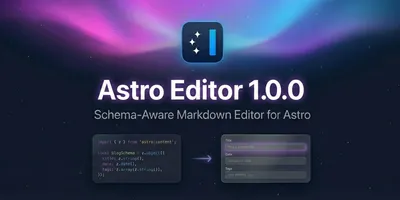
I've launched Astro Editor, a desktop app for authoring and editing Markdown and MDX content in local Astro Content Collections!
On Sass and Other CSS Preprocessors...

A comprehensive styleguide demonstrating how all key Markdown/MDX features, Astro components, and prose styles render in an article context.

I've launched Astro Editor, a desktop app for authoring and editing Markdown and MDX content in local Astro Content Collections!
On Sass and Other CSS Preprocessors...

A comprehensive styleguide demonstrating how all key Markdown/MDX features, Astro components, and prose styles render in an article context.

I've launched Astro Editor, a desktop app for authoring and editing Markdown and MDX content in local Astro Content Collections!
On Sass and Other CSS Preprocessors...

A comprehensive styleguide demonstrating how all key Markdown/MDX features, Astro components, and prose styles render in an article context.

I've launched Astro Editor, a desktop app for authoring and editing Markdown and MDX content in local Astro Content Collections!
On Sass and Other CSS Preprocessors...

A comprehensive styleguide demonstrating how all key Markdown/MDX features, Astro components, and prose styles render in an article context.

I've launched Astro Editor, a desktop app for authoring and editing Markdown and MDX content in local Astro Content Collections!
On Sass and Other CSS Preprocessors...
The compact prop hides the image and summary. Cards also compact automatically below
350px via container query:

A comprehensive styleguide demonstrating how all key Markdown/MDX features, Astro components, and prose styles render in an article context.

I've launched Astro Editor, a desktop app for authoring and editing Markdown and MDX content in local Astro Content Collections!

A comprehensive styleguide demonstrating how all key Markdown/MDX features, Astro components, and prose styles render in an article context.

I've launched Astro Editor, a desktop app for authoring and editing Markdown and MDX content in local Astro Content Collections!

A comprehensive styleguide demonstrating how all key Markdown/MDX features, Astro components, and prose styles render in an article context.

I've launched Astro Editor, a desktop app for authoring and editing Markdown and MDX content in local Astro Content Collections!

A comprehensive styleguide demonstrating how all key Markdown/MDX features, Astro components, and prose styles render in an article context.

I've launched Astro Editor, a desktop app for authoring and editing Markdown and MDX content in local Astro Content Collections!

A comprehensive styleguide demonstrating how all key Markdown/MDX features, Astro components, and prose styles render in an article context.

I've launched Astro Editor, a desktop app for authoring and editing Markdown and MDX content in local Astro Content Collections!
Note cards should use a blue accent border to differentiate from articles. The border colour is
set via --color-blue in the component's TYPE_CONFIG.
It's always been a source of irritation to me that whenever my FF installation breaks, or if I decide to reinstall it, I have to hunt down and reinstall all of my thirty-six extensions.
I heard a few hours ago that the average human brain has 116GB of data storage, and 16Mb of memory. Aside from thinking that 116Gb isn't very much considering the amount of stuff we can remember, I...
Over the last few weeks I've been using a nifty little web service called YubNub, it's basically a command line for the web and while it's not as astounding as it might sound it does make it a little...
Use manual props instead of a content collection entry for custom cards. The type prop
sets the label and defaults to "custom" with the accent border colour.
Layout component for displaying full notes with their content. Used on the notes index page and individual note pages. Unlike ContentCard (which shows previews), NoteCard renders the complete note with its content via a slot.
When a note has a sourceURL, an embed is automatically displayed. Tags appear as
pills below the title.
Remote work isn't just about where you work—it's about how you work. The best remote teams understand that asynchronous communication is the foundation, not an afterthought.
When you default to async, you give people the gift of deep work. Meetings become the exception, not the rule. Documentation becomes a first-class citizen.
Without tags or sourceURL—just title, date, and content:
Good defaults are invisible. Bad defaults create friction. The best software feels like it was configured just for you, even when you've changed nothing.
The site footer uses fixed .dark-surface styling regardless of theme. Includes PersonalLogo,
navigation links, RSS feeds, and SocialLinks.
Native HTML elements that aren't covered in Typography. These provide sensible base styles for forms, disclosure widgets, definition lists, figures, and media elements.
Form controls with proper <fieldset>, <legend>, and
<label> structure. Most forms on this site will be minimal, but having sensible
defaults ensures consistency.
Native HTML disclosure widget. Unlike our Accordion component, this uses no JavaScript and has built-in accessibility. The browser handles open/close animation.
The native <details> element provides disclosure functionality without JavaScript.
It's more accessible by default and works even when scripts fail to load. Our Accordion component
offers more styling control and animation options, but this native element is perfect for simple
use cases.
Yes! You can include any block content inside:
The summary acts as the clickable header, and everything else becomes the expandable content.
Adding the open attribute makes the details element expanded by default. Users
can still close it by clicking the summary.
The <dl>, <dt>, <dd> elements for term-definition
pairs. Useful for glossaries, metadata displays, or FAQ-style content.
The <figure> element with <figcaption> for self-contained content
with a caption. Distinct from BasicImage—this shows the raw HTML element styling.


Native HTML5 media elements. While most embedded media uses the Embed component (for YouTube, Vimeo, etc.), these native elements are useful for self-hosted content.
The native <audio> element with controls. Browser styling varies, but basic
functionality is consistent.
The native <video> element. For actual video hosting, consider using the Embed
component with YouTube/Vimeo for better performance and features.
The native <audio> element with controls. Browser styling varies, but basic
functionality is consistent.
The native <video> element. For actual video hosting, consider using the Embed
component with YouTube/Vimeo for better performance and features.
The native <audio> element with controls. Browser styling varies, but basic
functionality is consistent.
The native <video> element. For actual video hosting, consider using the Embed
component with YouTube/Vimeo for better performance and features.
The native <audio> element with controls. Browser styling varies, but basic
functionality is consistent.
The native <video> element. For actual video hosting, consider using the Embed
component with YouTube/Vimeo for better performance and features.
The native <audio> element with controls. Browser styling varies, but basic
functionality is consistent.
The native <video> element. For actual video hosting, consider using the Embed
component with YouTube/Vimeo for better performance and features.
Footnotes, inline footnotes, and other special treatments that don't fit neatly into other categories.
Footnotes are generated automatically from markdown syntax using [^label] for
references and [^label]: content for definitions. Three elements work together:
The superscript number in the text that links to the footnote. Styled with small caps and the accent colour. In the demo below, click any footnote reference to see the inline footnote behaviour.
When JavaScript is available, clicking a footnote reference shows the footnote content inline
below the current paragraph instead of jumping to the bottom. A close button dismisses the
popup. This is handled by the <InlineFootnotes> component.
A section at the bottom of the content containing all footnotes with back-reference arrows. This is the standard footnote behaviour and works without JavaScript.
Good writing often benefits from asides and references1. Footnotes let you add depth without interrupting the main flow of your prose.
The footnote reference appears as a superscript number2. Clicking it can either jump to the footnotes section at the bottom, or—with the inline footnotes enhancement—show the content right below the current paragraph.
Multiple footnotes work naturally throughout a piece4. They’re particularly useful for citations, clarifications, or tangential5 thoughts that would otherwise break the reader’s concentration.
This is contextual information that supports the main point but isn’t essential to understanding it. Footnotes keep your prose clean while still providing depth for curious readers. ↩
The superscript styling uses small caps and the accent colour to make footnote references visually distinct but not distracting. ↩
You can have as many footnotes as you need. The numbering is handled automatically by the markdown processor. ↩
Multiple footnotes in a single paragraph. ↩
Global utility classes available throughout the site. Most are documented here for reference;
.list-reset has a visual demo below.
| Class | Purpose |
|---|---|
.ui-style | Opt-out of prose typography for nav, footer, UI-heavy areas. Already demoed extensively via SGTypographySwitcher throughout this styleguide. |
.dark-surface | Forces dark background (charcoal) with light text (beige). For always-dark areas regardless of theme. |
.surface-white |
White surface context (light mode) or raised dark surface (dark mode). Also redefines
--color-background-secondary for children to ensure contrast.
|
.cq |
Establishes container query context (container-type: inline-size).
|
.all-caps | Uppercase text with wide letter-spacing. For labels and UI text. |
.center, .right, .left | Text alignment utilities. Useful for table cells and other contexts. |
.top, .middle, .bottom | Vertical alignment utilities. Useful for table cells and inline elements. |
.content-trim | Removes top margin from first child, bottom margin from last child. Use inside padded containers with slotted content. |
.img-cover |
Makes image fill container with object-fit: cover.
|
.sr-only |
Visually hidden but accessible to screen readers. Also available as
.hidden-microformat for hiding microformat metadata.
|
.external-arrow | Subtle arrow indicator for external/offsite links in UI contexts. |
.list-reset | Removes list styling for navigation/UI lists. See demo below. |
The .list-reset class removes default list styling (bullets, padding) for
navigation-style lists: