Website Redesign Part XV - A typographic system for the rest of this site
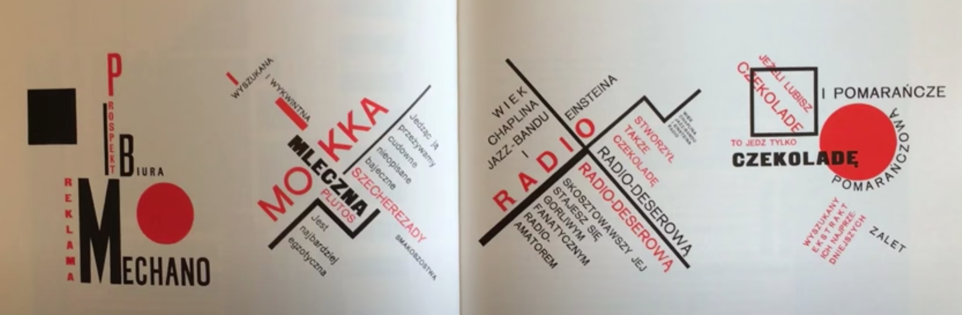
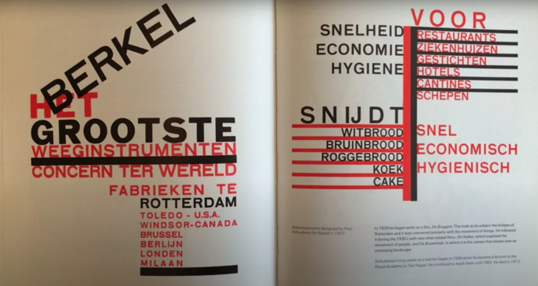
When I started this redesign I already had a fairly clear idea of the aesthetic I wanted, based on the existing design. These two pages show that off quite well.
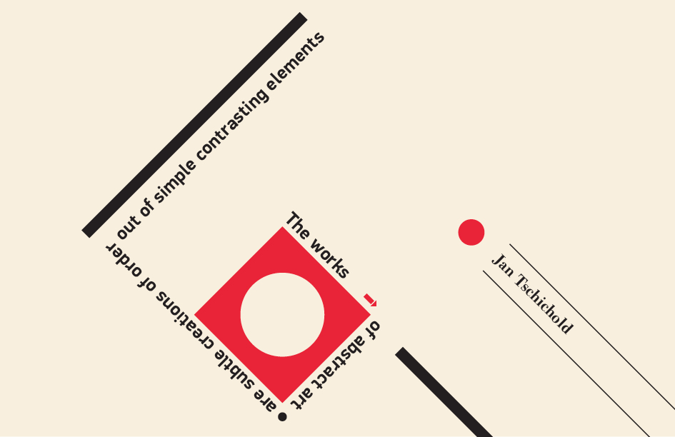
I’m not sure where I got this aesthetic from, but it’s clearly draws on the work of Jan Tschichold. Jan was a typographer and designer who’s famous for a whole load of stuff (go read his Wikipedia page). I particularly like this style, which is closely associated with him.
I spent quite a while trying to establish some sort of typographic hierarchy for the rest of the site based partly on some thoughts from my last article. Eventually I realised that this is really hard when I’m going for a deliberately “whacky” aesthetic. The kind of style I’m after doesn’t lend itself well to rigid hierarchy. And the fact I’m likely to size some type with viewport units makes this approach even less sensible.
So I went back to square one and decided on a few guidelines and constraints in place of a hierarchy:
- Use type and layout over imagery and effects.
- The site should always look good in greyscale. While I can use colour, it should never be the main design element.
- One typeface only, but I can use it in any weight or size that feels right.
- Always consider visual hierarchy, and be consistent across pages where possible.
- A grid of 20px, but with permission to ignore wherever it makes sense.
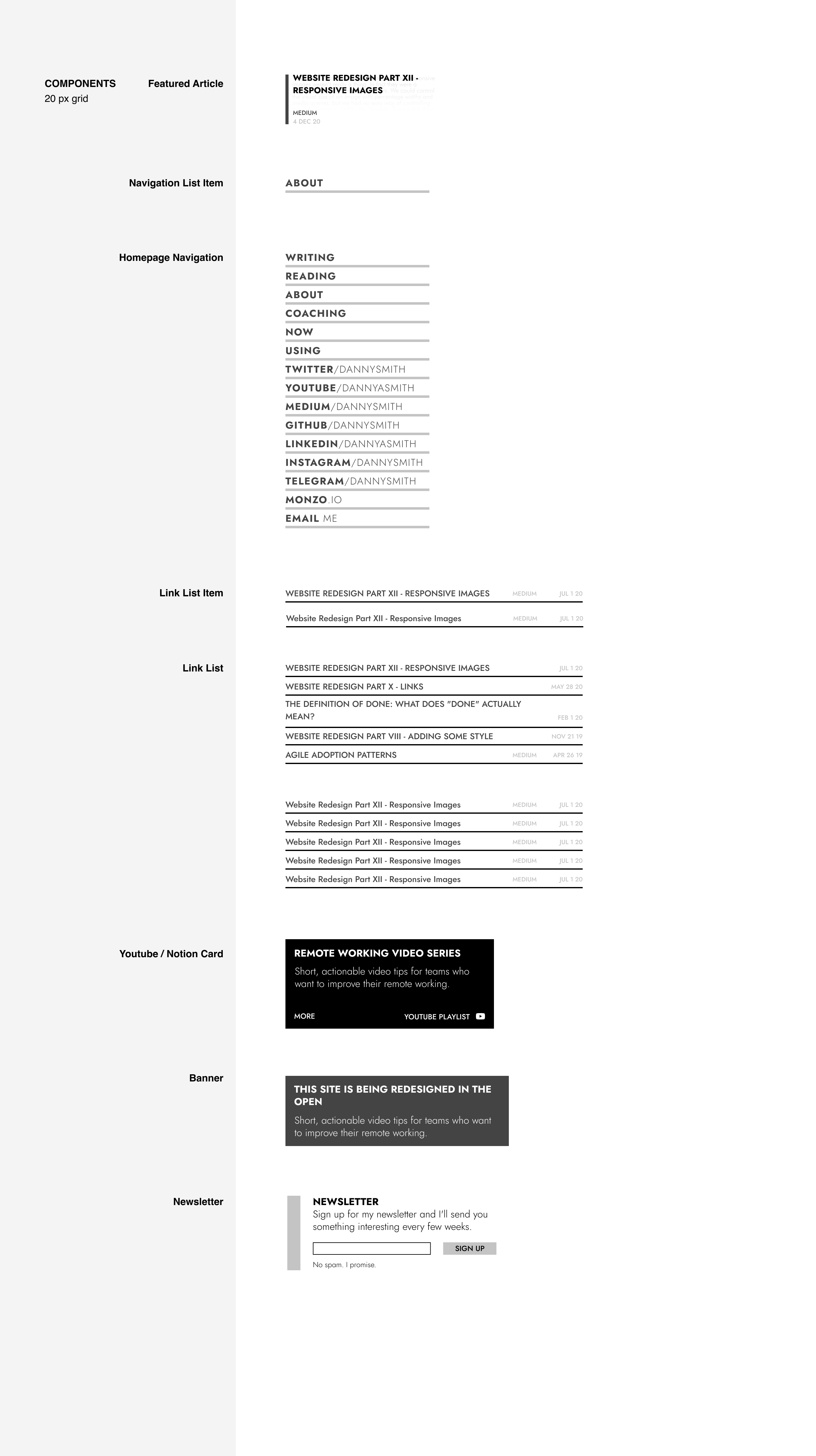
I also settled on a modular component-based approach where possible, and identified a few core components that will be useful in all sorts of contexts going forward. They’re deliberately simple and extensible in their design.
Deciding on a typeface
I spent way too long choosing a typeface for articles, so I’m keeping the simple. I decided to stick with Futura PT. It works perfectly for the look I’m going for and looks good in all caps, which I’ll probably be using a lot. This choice has some downsides though: the biggest being that it’s not available for free so I’d have to keep my Adobe Fonts license and accept the dependancy on Adobe’s service.
I’d pretty much decided to suck that up when I discovered Jost*. It’s a pretty close match for Futura, is open source and available as a variable font. It’s slightly larger than Futura but after a bit of trial and error I think it’s a good trade-off.
Text Styles & Components
With that decision made, I threw together a few basic components and text styles in Figma. there’s no real system for this – I started with the components, extracted text styles from them and then did my best to consolidate them a bit.
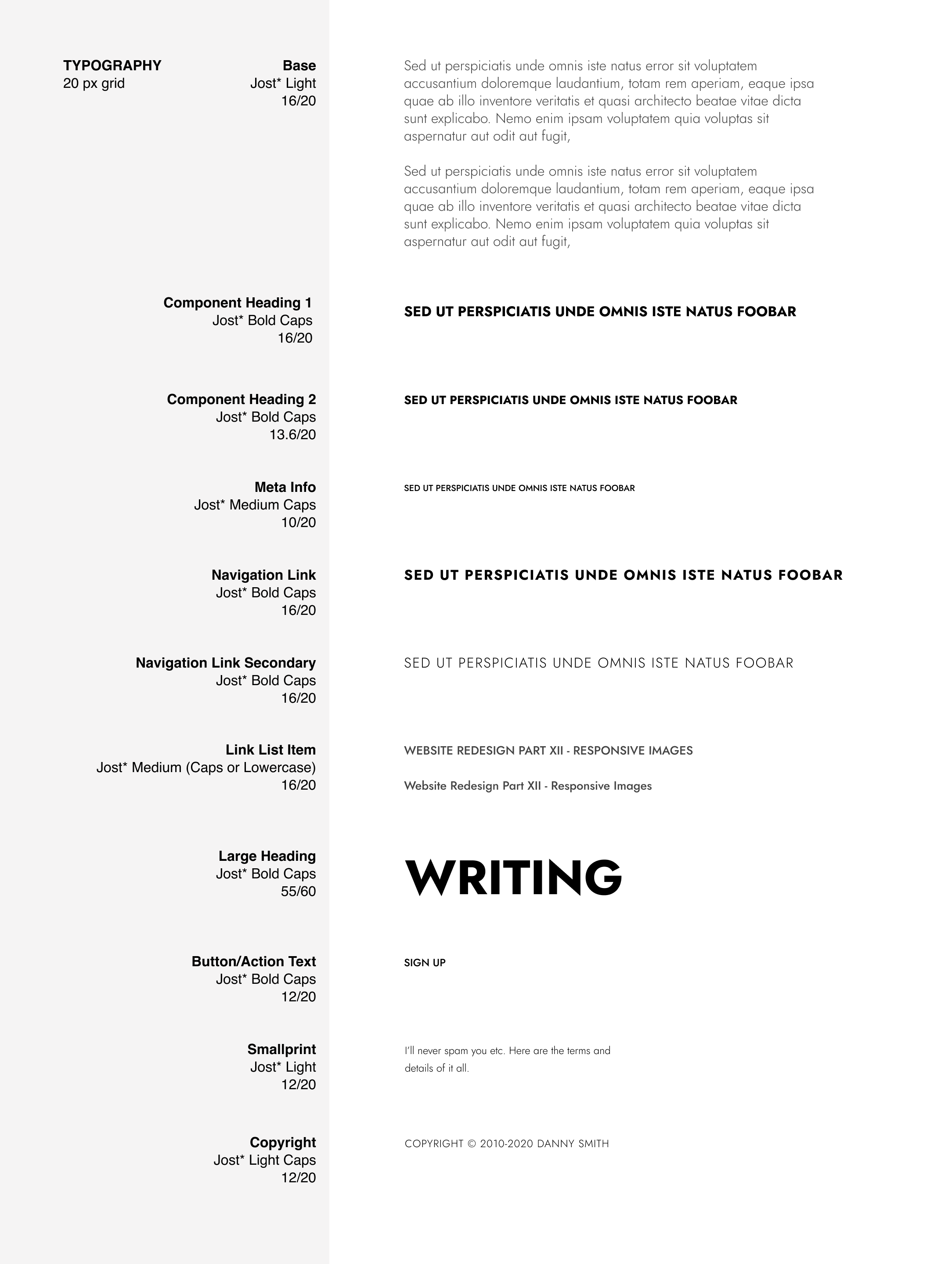
Having these styles and components is a great starting point for some experimentation. I’m gonna hold off coding them up until I’ve done a few iterations in Figma – I’m sure they’ll change a little bit as I play with them. The only technical work I’ve done is to build Jost’s variable version from source and bring it into my site.