Website Redesign Part XIII - Taking Stock of Content
I’m now pretty happy with how the essays on here look, so it’s time to turn my attention to the rest of the site. Although I have an idea of the aesthetic I’m after, every time I’ve opened Figma to have a play I’ve found myself staring at a blank page wrought with indecision – the dreaded writers block. Or rather, designers block.
I didn’t feel this at all when designing the essay pages because I had a clear idea of what I was trying to do. I already had content to work with and my only job was to make it as readable and beautiful as possible while keeping things simple. Clear goal. Clear starting point.
But with the rest of the site it’s not so clear. In Part IV I identified a list of pages I need to design, and I did some high-level pondering on goals and user needs in Part II. But beyond that, I’ve basically got no constrains and no starting point. And it’s paralysing me.
Back when I made websites for a living, the first thing I’d look at after user goals was a content audit. If the client didn’t have any existing content to audit, we’d focus on the content they thought they were going to have. So that’s just what I’m going to do now.
A Content audit for this site
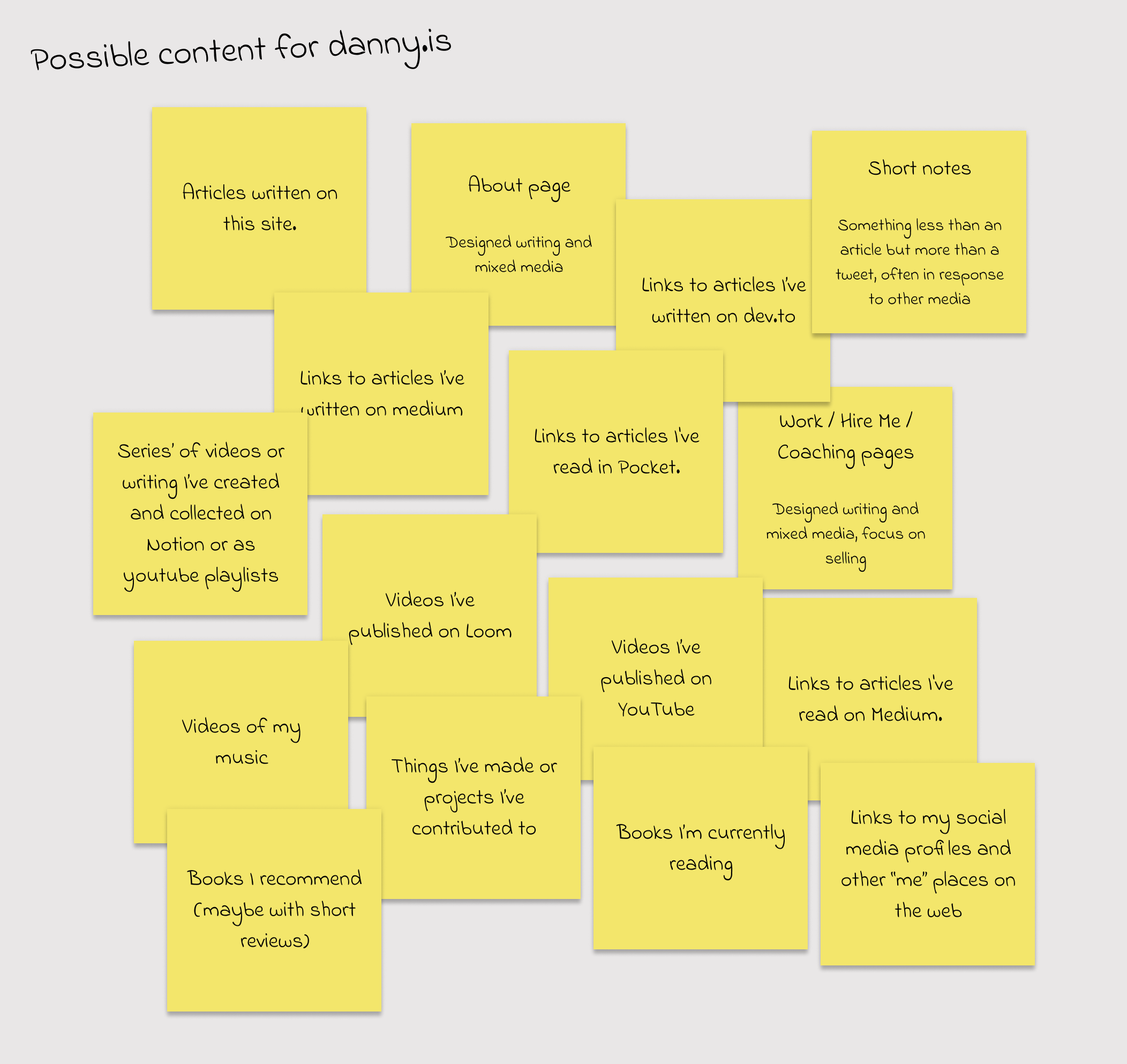
I can think of a hundred other things I might want to put here someday, but that’s all the stuff I’m thinking about putting here right now.
Organising the post-its
Let’s take a stab at organising these post-its according to a few different taxonomies. This might seem like overkill for such a small set of content but this exercise often throws up unexpected and creative ideas for organising and grouping. Even if we don’t use them, they can help seed concepts we use elsewhere.
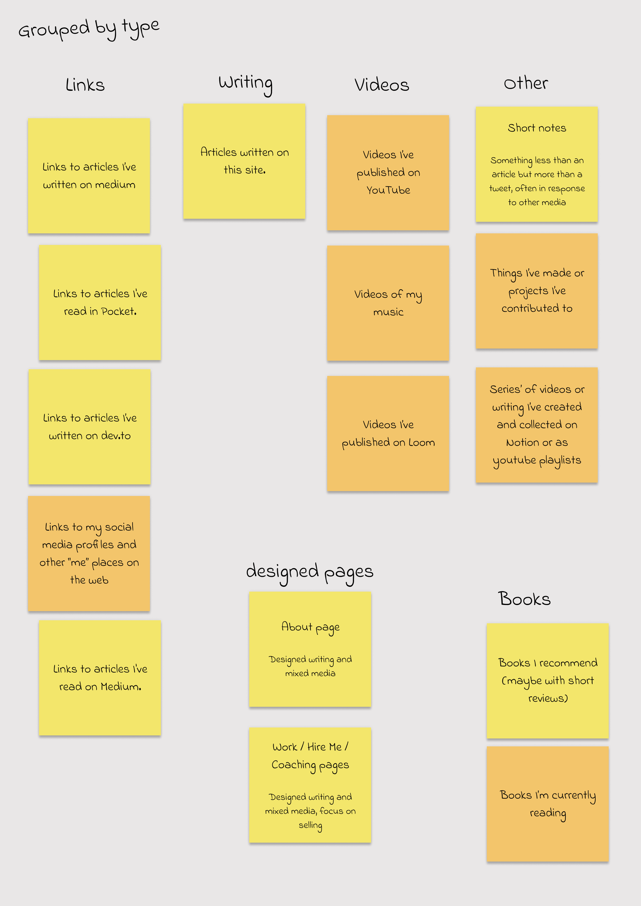
By type
Let’s start with the most obvious, grouping by content type – the first word of each post-it is a good starting point. We could also group by whether the content is mostly writing (yellow) or mostly something else (orange).
By author
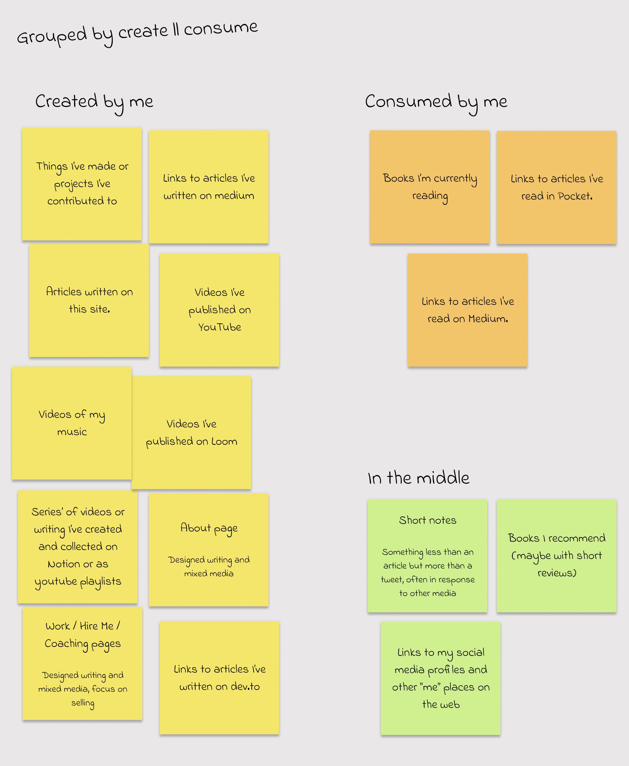
I’ve been thinking a lot about the creation and consumption of information lately, so it’s not surprising this springs to mind as a possible grouping: did I create it, or did I consume it? Some stuff is hard to categorise here – a book recommendation is clearly consumption, but what if I add my own review?
By professional or personal
Since this is a personal site, we could consider grouping the content by whether or not it’s related to my work.
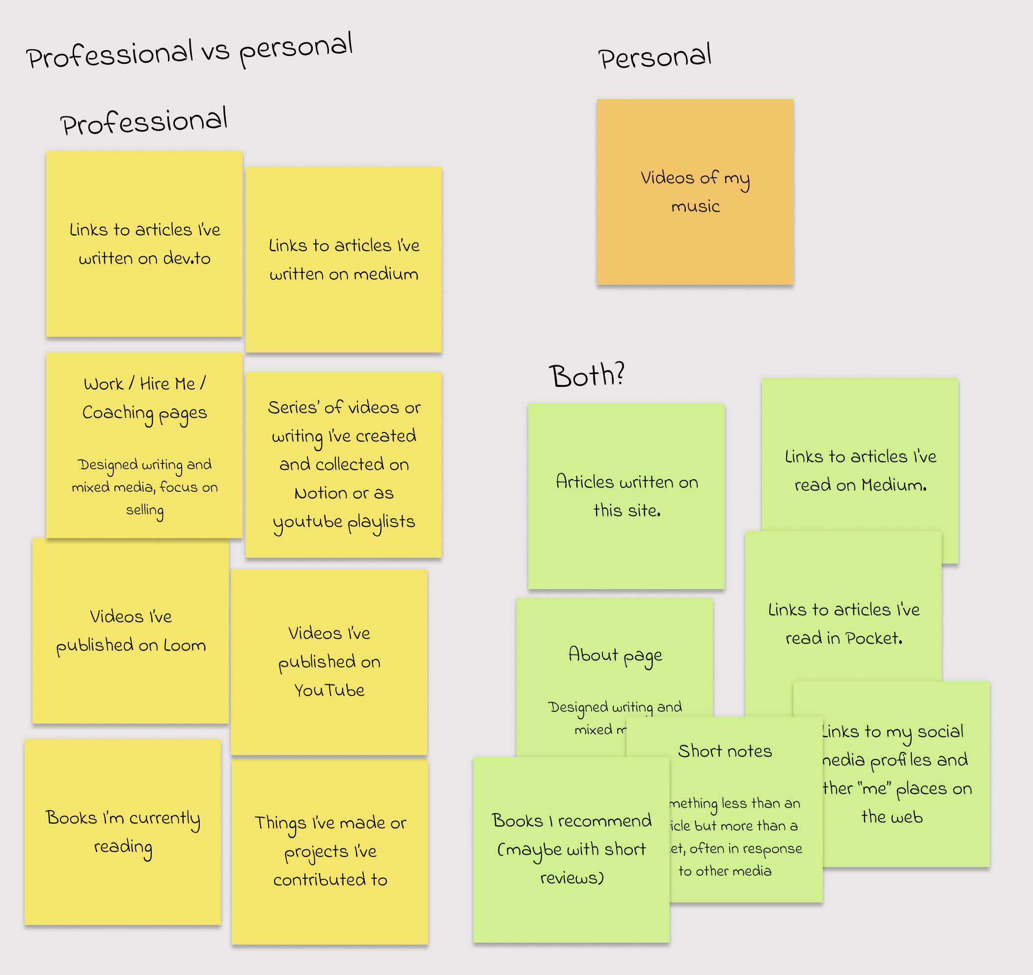
It’s pretty obvious that most of the content types here are focussed on my work. Looking at the both pile, the vast majority of content represented by each post-it is work-oriented. (While I do read some non-work articles via pocket, they’re in the minority. Likewise for articles on this site. Etc.)
So this grouping doesn’t feel very useful. Moreover, it doesn’t feel authentic – I’ve always mixed work and play and I’m not really sure where the line between them is. That solitary orange sticky note makes me question whether my music videos belong on this site, though.
By Importance
Some of these post-its are more important to me than others. My writing – whether on this site or elsewhere – is pretty core. As are links to my series’ on Notion. But the books I’m reading are much less important – I could live without having them on this site at all.
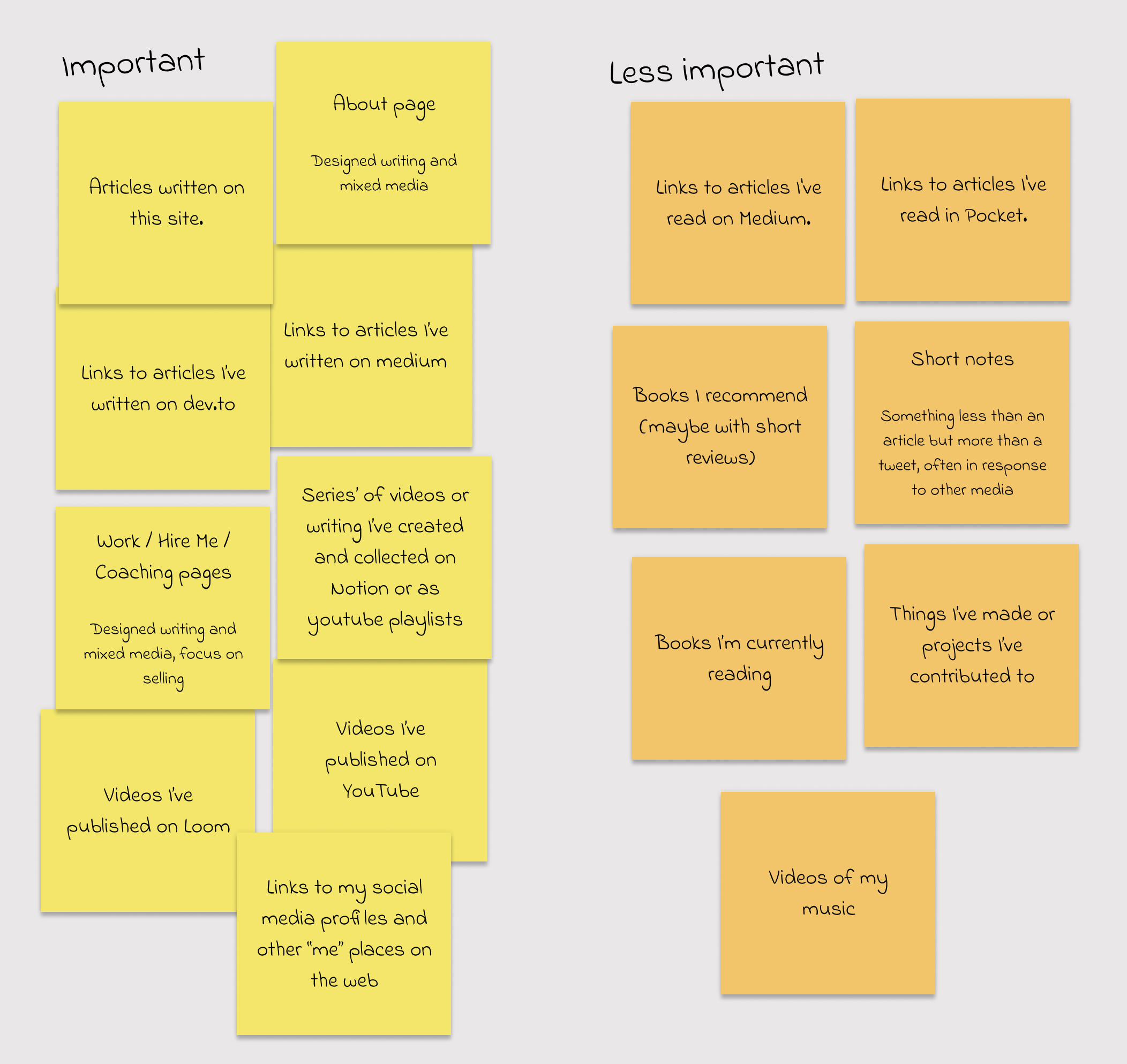
Perhaps the design should emphasise the important and de-emphasise the less-important? Or perhaps the less-important shouldn’t live here at all? My view of what’s important is almost certain to change over time, so if I do emphasise some content based on this it should be easy to change.
By Permanence
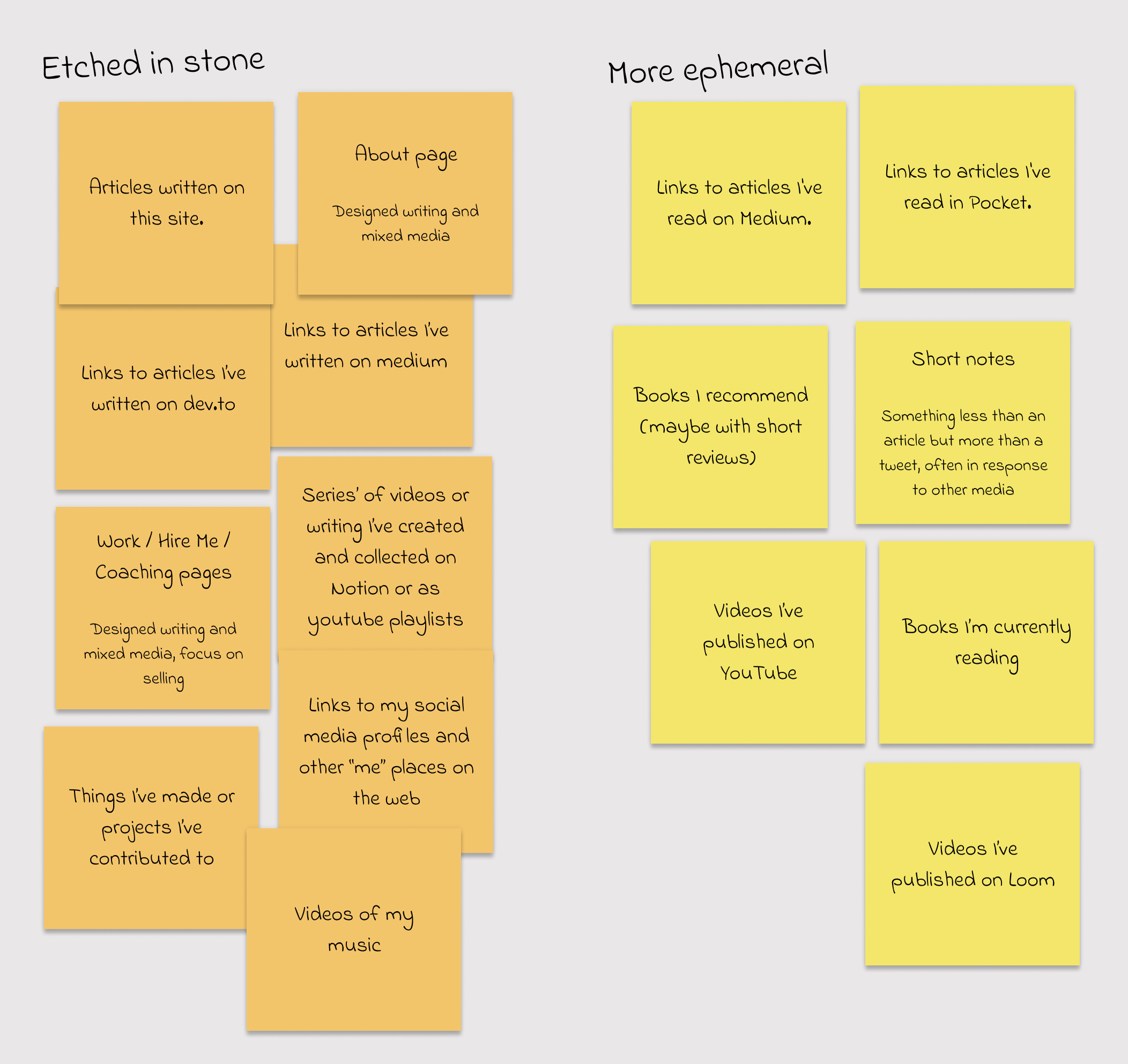
One of the main reasons I’m moving my writing to my own blog is permanence. I don’t like the fact that Medium controls my content and URLs. I want a more permanent place to put my words. Somewhere they can live forever – etched in stone, as it were.
The same is not true for other types of content. My tweets are ephemeral, for example: I wouldn’t be overly bothered if they all disappeared one day. Perhaps we could try grouping along these lines – stuff that I care about keeping vs stuff that I don’t.
But what about the actual content?
If you’ve ever done any information architecture you’re probably shouting at your screen right now…
BUT YOU HAVEN’T CONSIDERED ANY ACTUAL CONTENT! It doesn’t make sense to group based solely on medium.
You’ve got a point.
It’s kind of ridiculous to go through this exercise based only on the medium in which the content exists. We should also be considering things like subject area, target audience and purpose. For large sets of information these things will probably suggest much more useful taxonomies than content type.
I’ve ignored these so far because I don’t want to base the structure or conceptual design of this site on the topics I’m currently engaging with. I know too well how quickly they can change, and it’s important this site can adapt to those changes without much effort on my part.
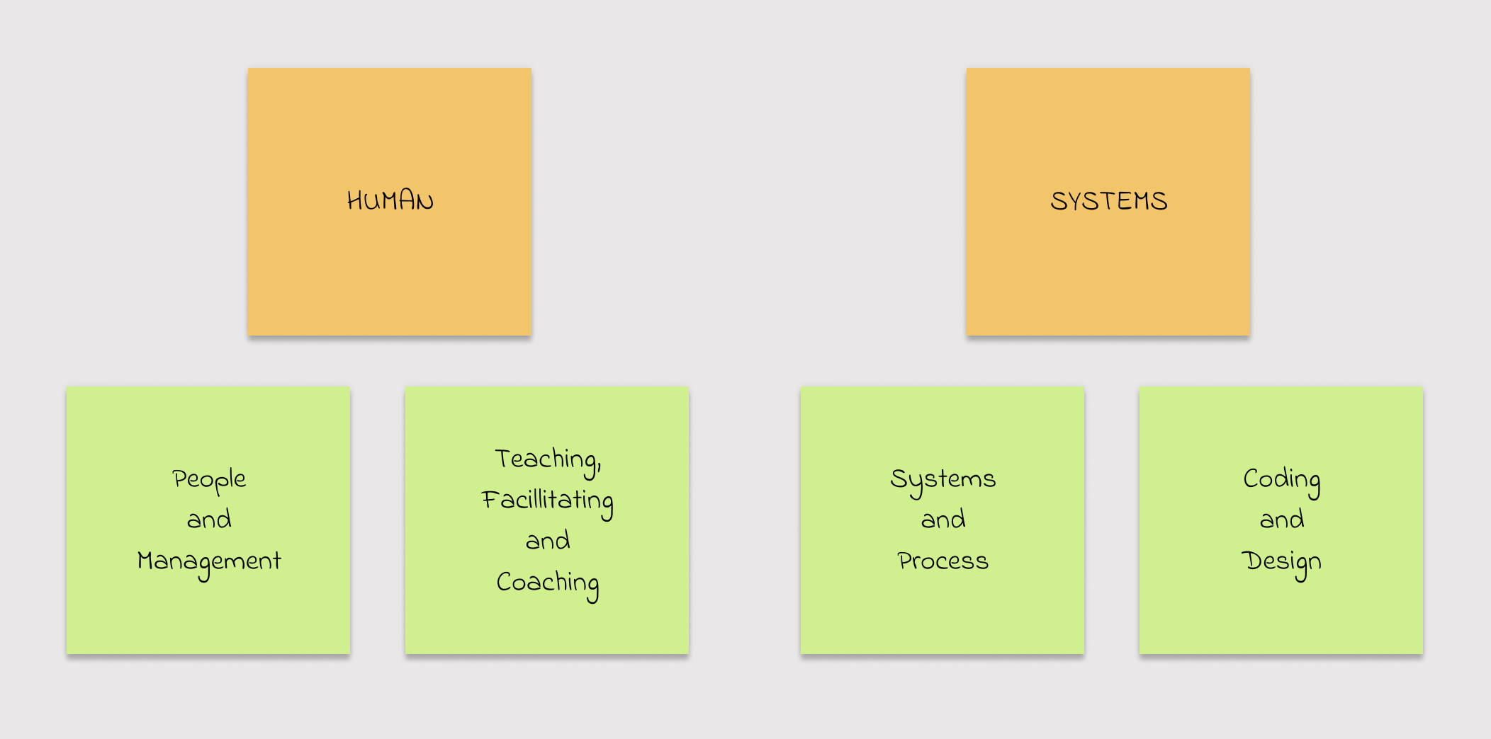
Having said that, I’d be foolish not to at least consider the kind of content I’m producing right now. For the past few years, my interests – and especially the stuff I write about –have fallen in one of four loose categories.

I’ve started to loosely group these into two super-categories: Human and Systems. The first includes everything where an actual human is the focus – think coaching, mentoring, nurturing etc. The second is focussed on the environment in which humans operate and how it can be engineered to provide the most useful support. I’ve been doing a lot of gardening during lockdown, so if you’ll excuse the metaphor…
Caring for a garden requires system design and engineering. Plants need the right soil, pots and sunlight. Some need the support of a rigid framework like a trellis. Growing from seed often means adherence to a thoroughly-researched process of feeding and repotting. But on its own, this stuff can’t possibly create a beautiful, thriving garden. Plants need to be nurtured and guided, and they won’t always do what we expect. As gardeners, we must observe individual plants and do what’s best for them, using our intuition and experience to guide us.
A creeper might grow without a trellis, but it will be in a random direction and will have to work much harder to get up the wall. But a trellis is useless without daily watering and occasionally guidance. And sometimes a creeper will ignore the trellis and decide to weave beautifully around a fence instead. It’s up to us to notice where it’s heading and either correct or encourage it. And perhaps remove the trellis, if it’s not proving useful.
Like creepers, people need trellis’. They’re the systems, habits, processes and frameworks that support us and make our lives easier.
We also need nurturing and the freedom to explore our own path. If we have good gardeners looking after us, we can rely on them to guide and prune as needed, and to move or replace the trellis when it isn’t helping.
The more I reflect, the more sense these two categories make to me. Both Human and Systems work need to be in balance, and my interests can be sorted fairly well into those two buckets. (It’s interesting that the least happy bits of my career have occurred when I’ve been too focussed on one or the other)
I’ll explore this idea further outside the context of this redesign, but it provides a reasonable starting point for a top-level grouping of my content.
How is all this useful?
What can we take from all this, and does any of it help with my designers block? This process has certainly sparked a few interesting thoughts which I’ll definitely come back to in the future. It’s also sparked a few that are useful now.
Grouping by type provides a good indication of the components I should think about (Link, Video, Book, Page, Article, Other), but is not useful as a way of actually organising content.
Grouping by author raises the possibility of subtly differentiating content I’ve created from content I’ve consumed/curated. I’m not sure how useful this distinction will be for readers, but it still appeals to me as something to consider.
Grouping by professional/personal isn’t really useful, though perhaps my music doesn’t belong on this site and I should just link to youtube.
Grouping by importance raises the need for flexibility. I need way of focusing attention on stuff that’s important to me right now, knowing it might change over time. This might be as simple as moving stuff that’s currently important to the top of some list, but this has design implications. It should be easy for me to promote/highlight different types of content as my needs change.
Grouping by permanence doesn’t feel very useful at all.
Grouping by Human/System, and by the four categories of content feels like a good starting point for some labelling system which I should explore further.
Keeping it simple
Simplicity is a the core value of this redesign and working through this process has helped me reach a few decisions about how to simplify things.
- I’ve no need for a coaching page right now. I can add this in the future.
- I still want a hire me page but it makes much more sense for this to live in notion. I’ll forward
https://danny.is/lookingforworkandhttps://danny.is/hiremeto a public Notion page and be done with it. - I won’t show any actual videos on my site. Instead, I’ll present any video series’ as links to notion pages or YouTube playlists. I already have these set up.
- I won’t have a page for my music. I’ll just forward
https://danny.is/singingto my dormant youtube channel. I will show this link on the homepage, though – singing is a big part of who I am. - I won’t worry about notes for the moment1. They’re an important part of how I’d like to share content but aren’t a priority and Notion might well be the best place for them.
- I don’t care about books at all right now. If I really want to write a book review I can just write an article.
- Core design concepts should be expandable to accommodate the unknown. For example, these would be bad ideas:
- Deciding I have three main types of content and basing my entire design concept on “threes”.
- Having all my videos on youtube and Loom, and using their brand colours as core design elements.
Wrapping up
I started this article as a way to get over writer’s block, hoping that a content audit would help provide a few constraints and possible design directions. It’s been an interesting little exercise and has definitely helped unblock me, but when I think about it all I’ve really done is intentionally focus my attention the same problem I had in the first place: what should I have on this site and how should I organise it?. So while this “content audit” was interesting, its real value came from forcing me to consider this problem in a structured, systematic way.
Footnotes
-
If you’re wondering what I mean by notes, I used to use tumblr for this sort of thing. ↩