Website Redesign Part XIV - Stepping Into Figma
Figma is one of my new favourite tools. I’ve been an avid fan of Sketch since I first picked it up in 2011. Compared to the other tools available at the time, it was a breath of fresh air. I still remember how excited I felt after I first used it for some actual work.
The first time I used Figma I had a similar feeling. Everything was just easy. Coming from Sketch, Figma felt comfortable and a lot of the keyboard shortcuts are the same so no need to reconfigure my finger-memory. Figma has some major advantages over Sketch. It’s web-based so it runs on any machine with a browser and my files live in the cloud by default. Anything I can do to simplify my laptop’s setup is a win for me. It also has great multiplayer – working collaboratively is an absolute joy. And it feels simpler than Sketch. The interface feels more intuitive and the way it handles components feels way more natural. So I’m now using Figma for pretty much all my design work.
Until now, I’ve been designing this site in the browser and haven’t felt the need for a design tool. But now I’m getting to the rest of the site, I know I’ll want to experiment with layout and colour faster than CSS allows. I also want to explore Figma’s component and shared styles features and this feels like a good excuse.
Text Styles
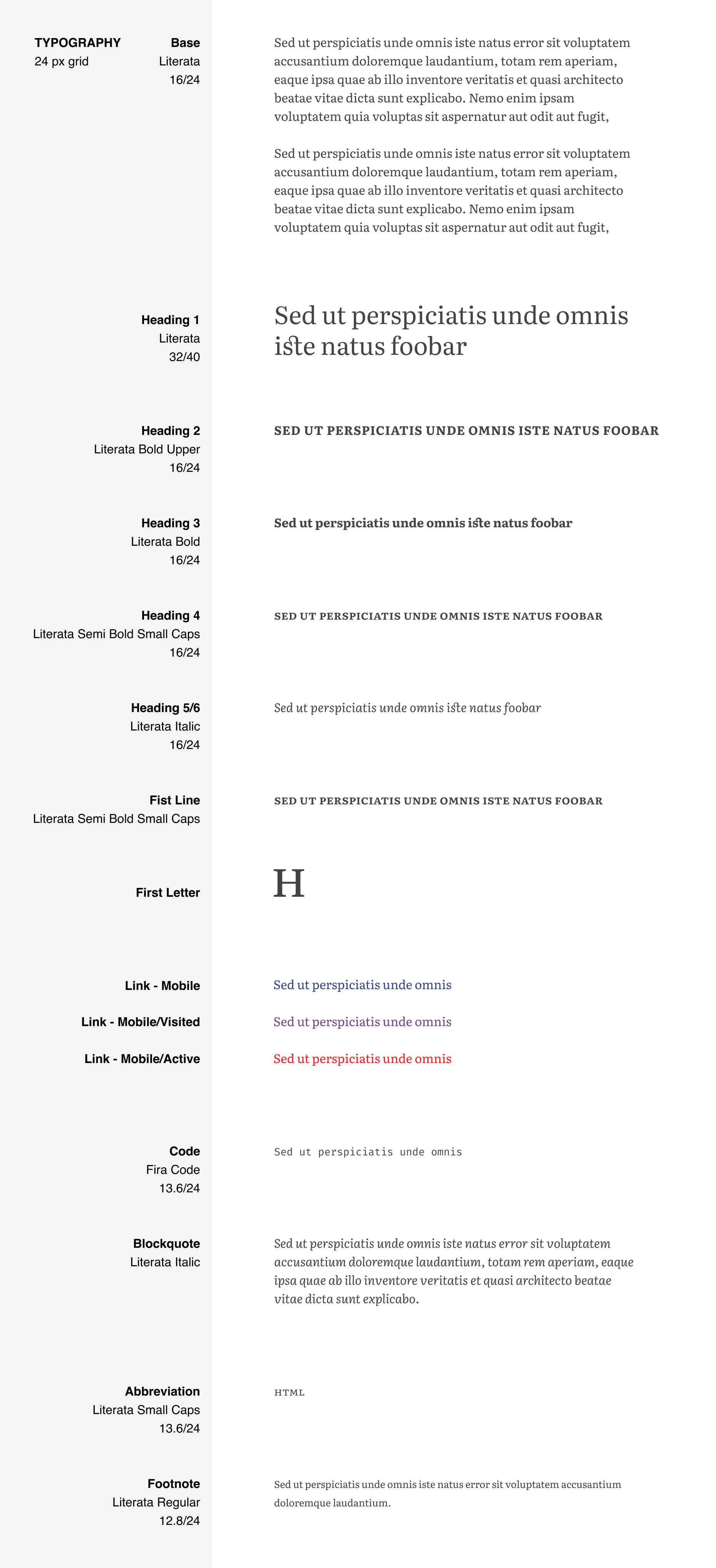
We can recreate the styles for these essays pretty easily. If we assume 16px as our base font size, it’s just a matter of doing some maths based on the em values in our CSS to get the size and line-height of all our text styles. Figma also lets us control some of the more advanced font features we’ve been using in our CSS.
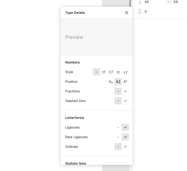
With very little work, we can create a styleguide and create corresponding text styles. Here’s what I ended up with.
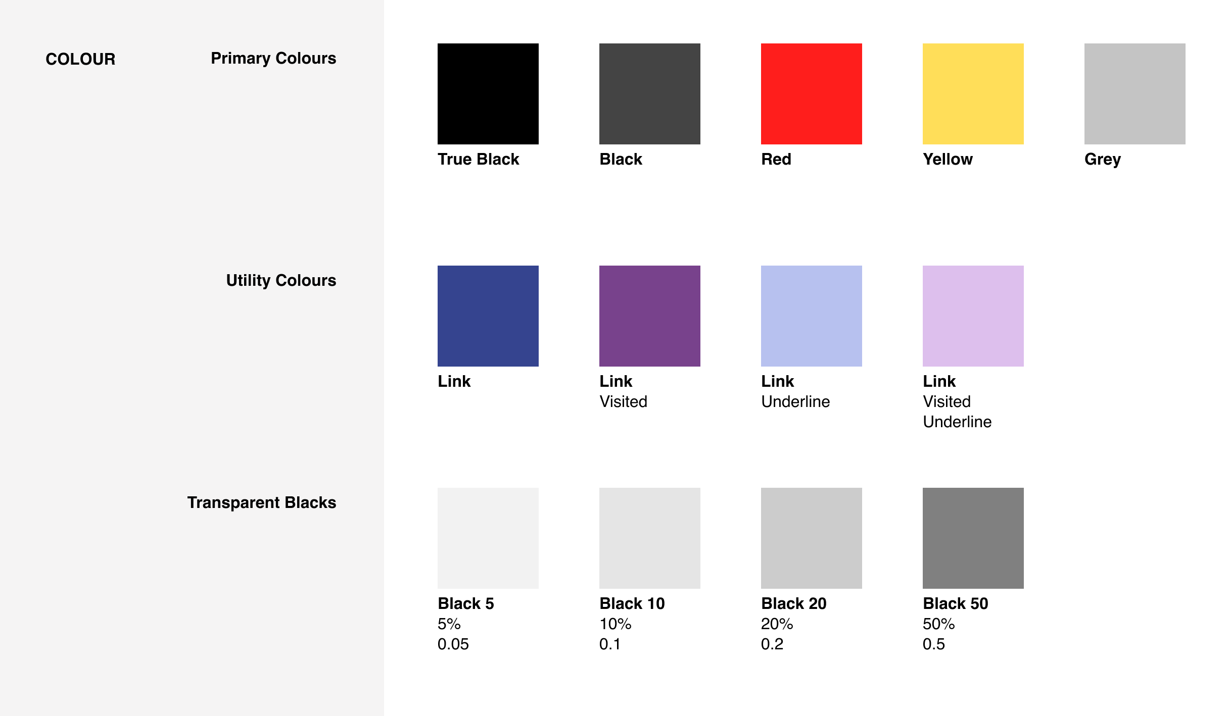
Colour Styles
While I haven’t given much thought to colour there are a few colours that I’m using in the CSS, so it makes sense to create some named colour styles and a palette in Figma too.
Grids
Since the line-height for my essays is 1.5, the baseline grid is 24. I use this measurement quite a lot in the CSS already, both for horizontal and vertical spacing. Figma allows us to create grid styles which we can apply to frames. Let’s create a simple grid style for 24px, and use it to position some content on the grid.
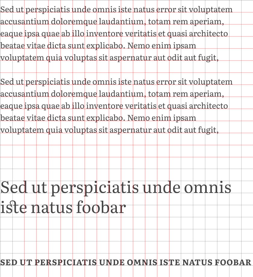
We can also create a grid that represents one line-height’s worth of padding around a frame, like this.
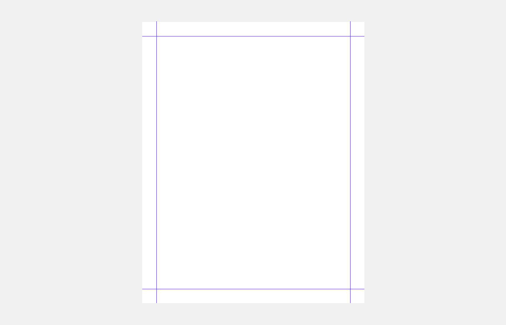
The trick is to create two grids, one Rows and one Columns, both with the same settings:
- Count: 1
- Type: Stretch
- Margin: 24 (your desired padding)
- Gutter: 0
Then we can combine both grids by creating a Grid Style that includes them both. And voila, we have a grid that we can apply to any frame to give us the correct guides for padding.
Components
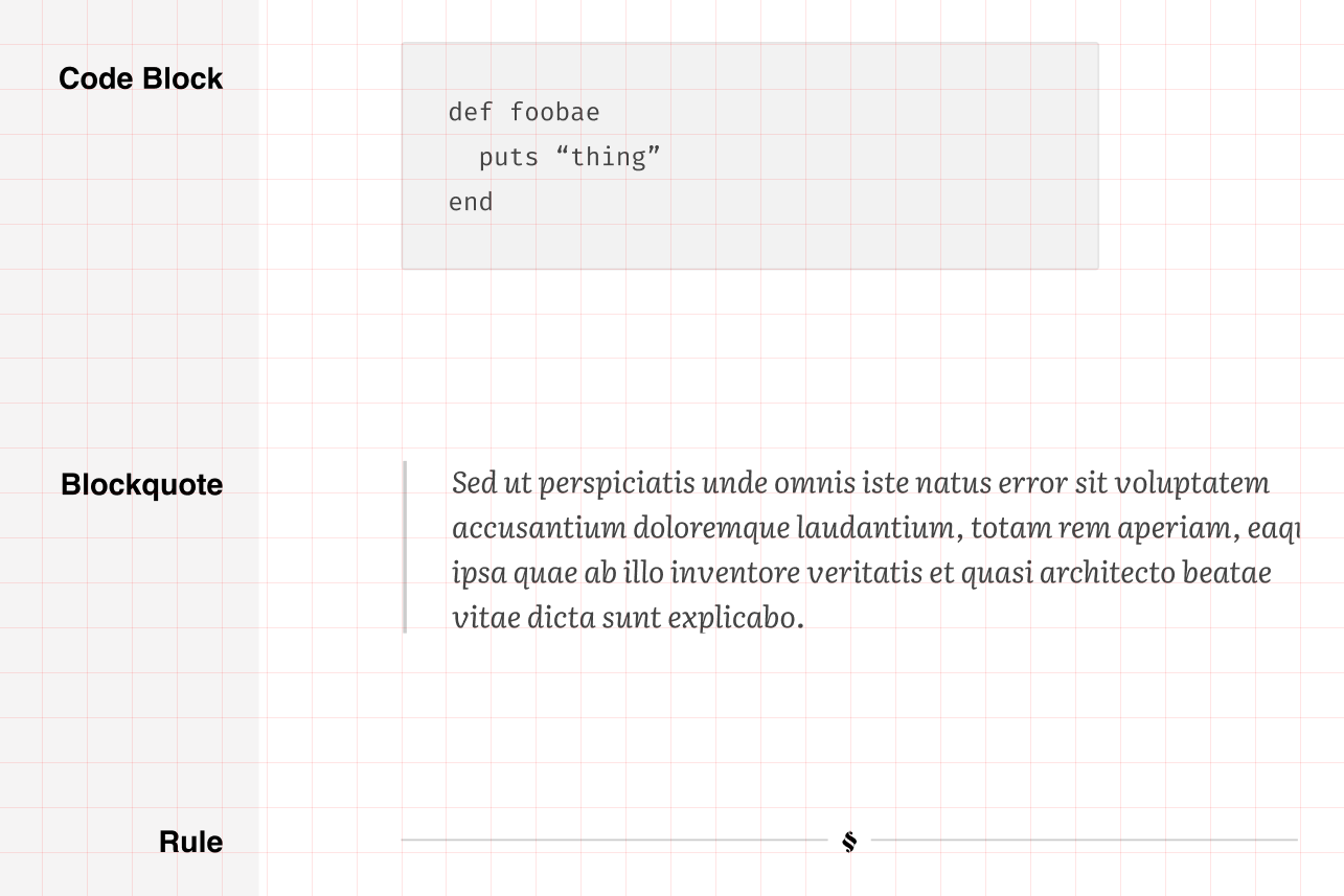
Before we can call this minimalist design system done, we need to account for a couple of components that we can’t create using text styles alone: code blocks, blockquotes, lists and horizontal rules. We’ll create these as components, using the text and colour styles we’ve already defined. By using constraints we can ensure the content adapts properly as component instances are resized. Here’s what I ended up with.
Summary
None of this is especially useful right now, but it’s provided a starting point from which to design the rest of the site and taught me a few things I didn’t know about Figma.