Website Redesign Part XI - Code Blocks and Section Rules
I spent a long time [deciding on a typeface]({% post_url 2020-06-20-website-redesign-v %}) for these essays and I don’t want to spend nearly as long on code snippets. Although this series involves a lot of code snippets, I generally write about code a lot less than I used to, so it doesn’t make sense to spend ages on this. I use the wonderful Operator Mono in my text editor and I briefly considered paying for a web license so I could use it here too. But while I love it, it’s quite unusual and is definitely not suited to everyone’s taste. Both the typeface itself and the act of buying a web license are the opposite of simple, one of my stated values for this site. So instead, I’ll stick with the same requirements I used before: open source, ideally with variable and static versions, with nice ligatures and a range of weights.
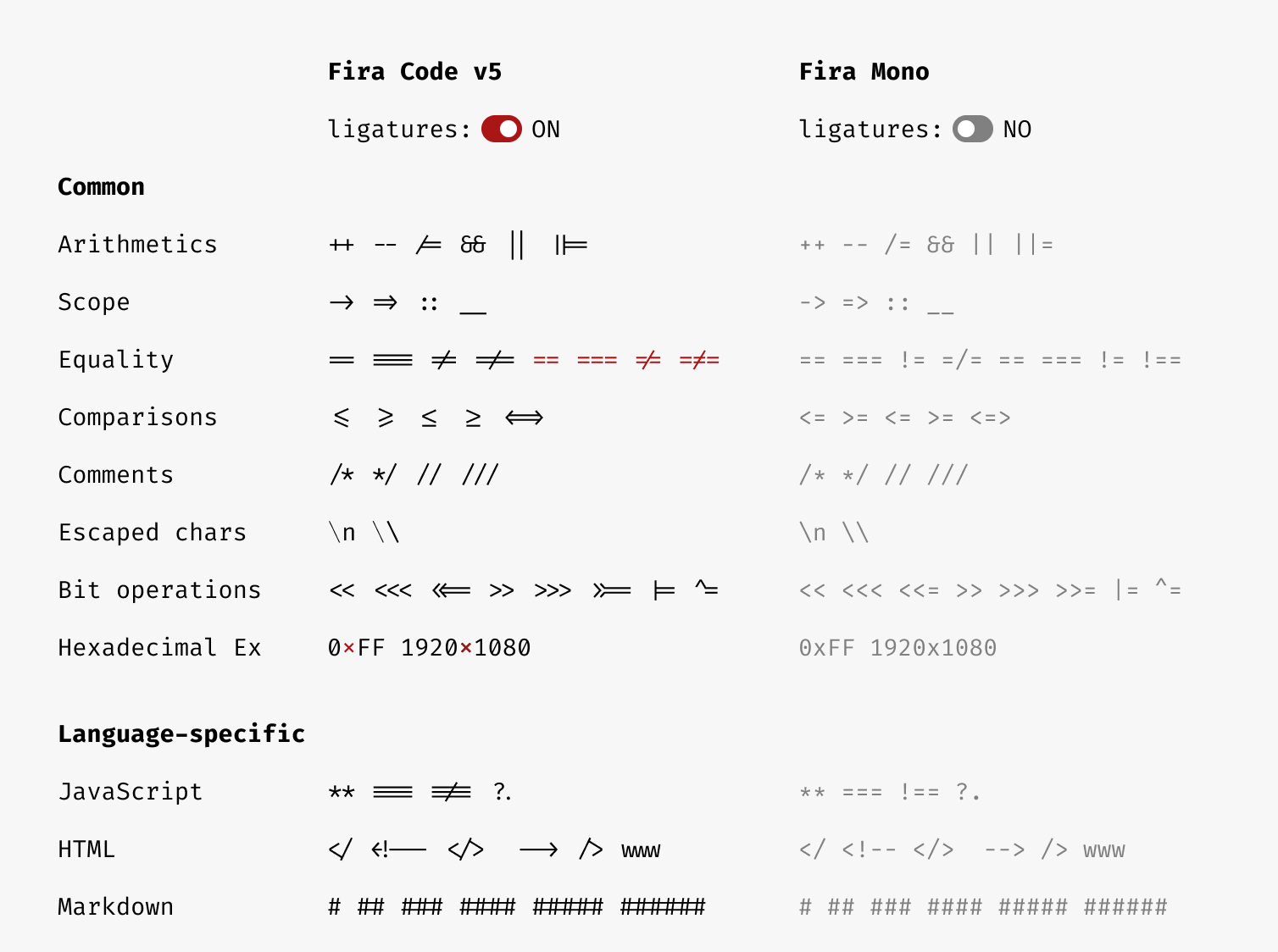
The first thing that came to mind was Fira Code, an extension of Mozilla’s Fira Mono which was designed specifically for legibility. Fira Code adds a bunch of ligatures for character combinations commonly used in programming, as well as making a few adjustments to make code more readable.
The CSS
Although Fira Code is available via google Fonts it doesn’t support all the opentype features I want, so I ended up cloning the repo and moving TFF, WOFF and WOFF2 versions into the the assets folder like I did for Literata. They’re included in webfonts.scss and have a custom property set just like the other fonts too.
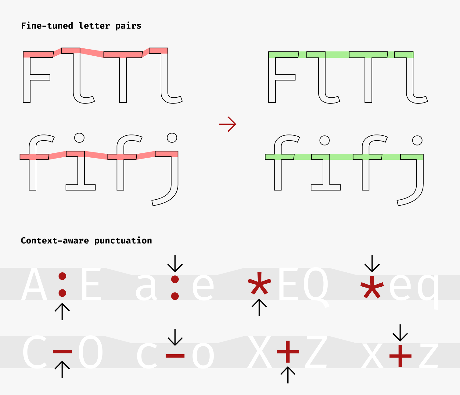
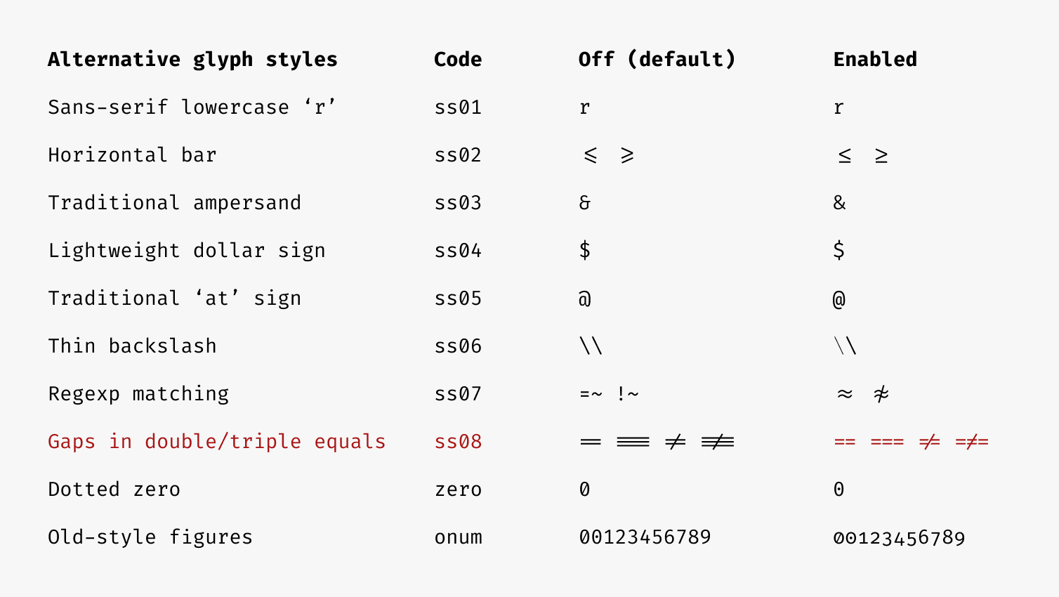
:root { --font-code: 'Fira Code', 'Inconsolata', monospace; @supports (font-variation-settings: normal) { --font-code: 'Fira Code Variable', 'Inconsolata', monospace; }}Since we want to use Fira code everywhere there’s code, we can set this as the default font for all code elements, whether inside essays or not. We can also use some of the advanced stylistic settings to turn on a sans-serif lowercase ‘r’ and put gaps in double equals signs. I think this makes code a little more readable.
code { font-family: var(--font-code); font-feature-settings: 'ss01', 'ss08'; // sso1 = sans-serif lowercase "r" // ss08 = Gaps in double/tripple equals // See https://github.com/tonsky/FiraCode/wiki/How-to-enable-stylistic-sets}Fira code has a bunch of other features like this
Styling inline code
We’ll set the font size to the same as the samm-caps we’re using for abbreviations, which is about equal to the x-height of the body copy. Adding a border, background and a little padding to the left and right is the simplest thing I can think of to differentiate inline code snippets. We’ve also prevented breaking spaces with white-space: pre, though I might need to revisit this if I end up writing some very long inline code snippets.
.essay code { font-size: 0.85em; padding: 0 0.5ch; background-color: rgba(0, 0, 0, 0.05); border: 1px solid rgba(0, 0, 0, 0.1); border-radius: 1px; white-space: pre;}Styling code blocks
We already set up some basic styles for <pre> elements, so all we need to do is remove the styles we just set for any <code> elements that appear within them.
pre {  border: 1px solid rgba(0, 0, 0, 0.2);  padding: calc((1em * var(--base-lh)) - 2px);  background: rgba(0, 0, 0, 0.05);  overflow-x: scroll;
  code {    padding: 0;    background-color: transparent;    border: none;  }}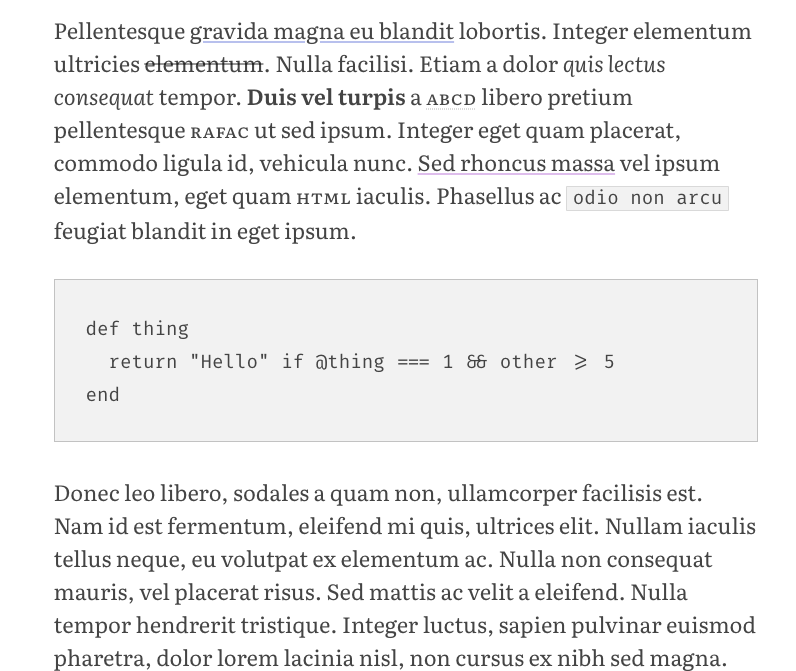
The final thing to do is add syntax highlighting. Since we’re using Jekyll, any fenced code blocks that have a language defined on them will use Rouge to apply syntax-highlighing classes in the same way Pygments does. This means we can take an existing theme stylesheet and include it in our bundle. I used this one and tweaked a few of the colours slightly. I’ll come back to this once I have a colour palette for the site.
Horizontal Rules
I’ve always liked the section mark (§) and thought it might be nice to superimpose this on horizontal rules. The code for this is pretty simple – we’ll add a psuedo-element containing the mark and use flexbox to position the hr and psuedo element on top of each other. A bit of padding and a background on the psuedo element creates a gap in the line, and a little nudging with translateY vertically centres the mark.
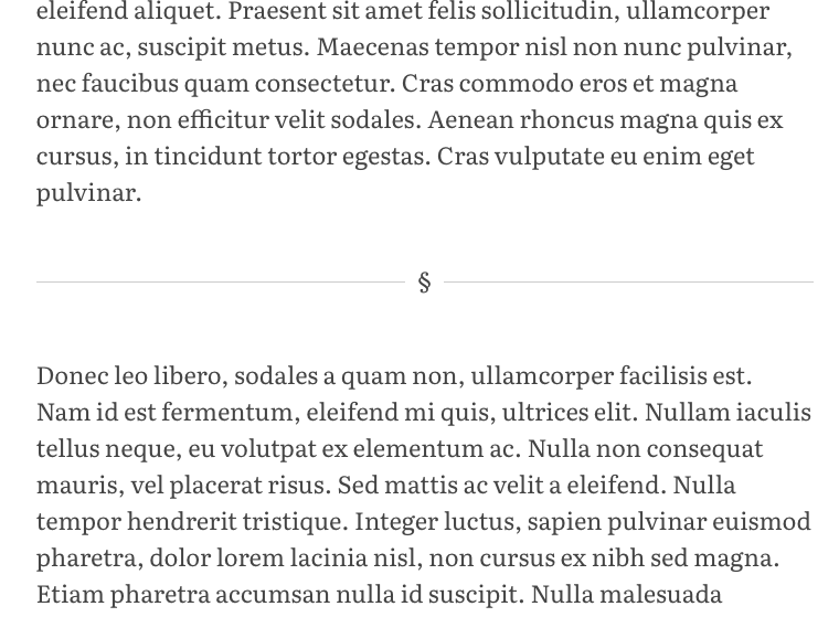
.essay hr {  display: flex;  align-items: center;  justify-content: center;
  border: 0;  border-bottom: 1px solid rgba(0, 0, 0, 0.2);
  &:before {    content: '§';    transform: translateY(-0.15em);    background: var(--color-white);    padding: 0 0.5em;  }}
It would also be nice to add a little more margin than usual either side of the rule. Since we’re using only top-margin to maintain vertical rhythm, we need to use the sibling selector to add margin to the element immediatly following the <hr> as well as the rule itself.
.essay hr,.essay hr + * { margin-top: calc(2em * var(--base-lh));}