Website Redesign Part X - Links
Hyperlinks are what makes the web special. They allow us move seamlessley from idea to idea at our own pace. While we tend to read books sequentially, websites are more like choose your own adventure books – hyperlinks let us choose how we experience them. And it’s that way by by default. So links should be pretty prominent on this site. But at the same time, an article peppered with bright blue links is not easy on the eye. Where links are incidental to the text (as many are), they interrupt the flow of reading. I’ve spent a fair bit of time thinking about how I want links to work and I basically have two requirements.
- They must get out of the way when reading and not be a distraction.
- They should obviously be links for users who are looking for them. This includes differentiating between unvisited and visited links.
Let’s start off by removing styles from hyperlinks that have a class. This gives us a good starting point for styling UI links and also deals niceley with the footnote links that jekyll creates.
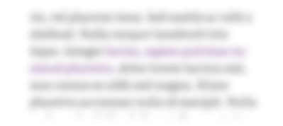
a[class] { text-decoration: inherit; color: inherit;}The default clours in most browsers are blue for unvisited links and purple for visited links, so I like the idea of sticking with that since it’s alrreasy well-understood by most users. Rather than colouring the whole word, we might be able to get away with colouring just the underline. This makes the links far less intrusive. we can also pick much less saturated colours than the default.
The hover styles can afford to be a lot bolder and brighter. Something like…
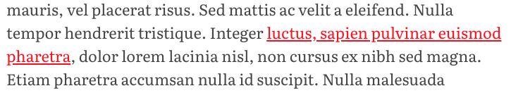
We can achieve this by setting links to inherit their text colour from their parent and styling the underline with text-decoration-color. We’ll also add a subtle transition on hover and force the underline width to 1px on browser that support it.
--color-link-underline: rgba(111, 131, 222, 0.5);--color-visited-link-underline: rgba(188, 127, 219, 0.5);--color-active-link-underline: rgb(255, 30, 28);
a:not([class]) {  color: inherit;  text-decoration-color: var(--color-link-underline);  text-decoration-thickness: 1px;  transition: all 0.25s;
  &:visited {    text-decoration-color: var(--color-visited-link-underline);  }
  &:hover,  &:active {    text-decoration-color: var(--color-active-link-underline);    color: var(--color-active-link-text);  }}
This feels okay on devices with a pointer. Although the underlines are subtle, if the user isn’t sure it’s a link, they can mouse over and the transation will make it pretty clear. But on touch devices this is impossible, so it feels sensible to make the links a little more ovbious somehow. On mobile devces the text also has a much smaller measure and therefore more multi-line links, whihc looks kinda ugly.
We can alter our code to cremove the underline on touch devices and instead change the text-colour. I’m using a similar blue and purple here, but it’s nececarrily much darker and without an alpha channel. I tried to use a colour that didn’t affect the typographic colour of the text. If you try squinting and looking at the mobile version the links shouldn’t feel lighter or heavier than the rest of the text.
a:not([class]) {  //...
  @media (pointer: coarse) {    text-decoration: none;    color: var(--color-link-text);  }
  &:visited {    text-decoration-color: var(--color-visited-link-underline);
    @media (pointer: coarse) {      color: var(--color-visited-link-text);    }  }
  //...}
Finally, I want to do something about the outline browsers apply when a link is focussed by keyboard. I don’t want to do too much with this for accessibility reasosns, so we’ll just change it from blue to our brand red using the focus visible psutedo-selector. I’ll revisit keyboard navigation once I have a color palette for the site.

a:focus-visible { outline: 3px solid var(--color-red-trans50);}