Website Redesign Part VII - Responsive Typography
Having settled on a typeface for my essays, it’s time to set up some basic typography. In the past, I’ve spent a lot of time building maths-based ype systems with myriad variables and functions and it’s so tempting to go down that route this time and try to create a system that caters to every eventuality. But that would be at odds with my simplicity value, so for the time being I’ll stick to the basics. We’re going to set up a base font size and line height and scale that as the viewport grows. We’ll also add just enough whitespace to create a nice vertical rhythm and create some visual hierachy by styling the headings. Everything else can wait.
Base font-size
We’ll start off by setting the font-size of the HTML element to 100%. This makes sure that 1rem will always represent the default font-size of the device or browser - usually 16px. We’ll use rems and ems to define pretty much every other size in the site, so we’ll also set the body font-size in rems so it’s inherited by other elements.
We also want to reset the heading sizes to 1em. We’ll probably redefine some of these later but I always think it’s a good idea to start with one size for all elements, since it often makes sense to differentiate headings with weight, style or color rather than size. We’re using ems rather than rems here because we want them to scale if we change the font-size on their container.
html {  font-size: 100%;}
body {  font-size: 1rem;}
h1,h2,h3,h4,h5 {  font-size: 1em;}
Scaling Type Size
We can use the new CSS clamp() function to enable responsive type without the need for a million media queries. This will scale the type from 1rem (16px) to 1.375rems (22px). The middle value is calculated using both viewport units and rems: the vw causes the type to scale with the viewport width and the rems ensure that user-initiated text resizing still works. I arrived at 0.6rem after a bit of experimentation.
.essay { font-size: clamp(1rem, calc(0.6rem + 1vw), 1.375rem); transition: font-size 0.1s;}Hyphens
Enabling hyphenation can make a big difference to readability on small screens, where an uneven right rag can cause very short lines. We can set up a SCSS variable for breakpoints and then use a media query to turn hyphenation off for larger viewports.
$breakpoint-m: 42em;
.essay > p {  -webkit-hyphens: auto;  hyphens: auto;
  @media (min-width: $breakpoint-m) {    -webkit-hyphens: none;    hyphens: none;  }}
Vertical rhythm
The main purpose of a baseline grid is, unsusprisingly, aligning the baselines of text. This makes a huge difference when we have multiple columns of text with differing fonts, sizes and the like.
While this makes a huge difference to the feel of a page, the fluid nature of web pages (and the way line-height works) makes this quite hard to do consistently. We can avoid this problem entirely by only having one column.
But baseline grids can also provide a sense of vertical rhythm – something we can do on the web without too much effort. We just need to work out how high each of our lines is and use multiples of that measurement to space things out vertically. (It can also make a good measurement for horizontal spacing.)
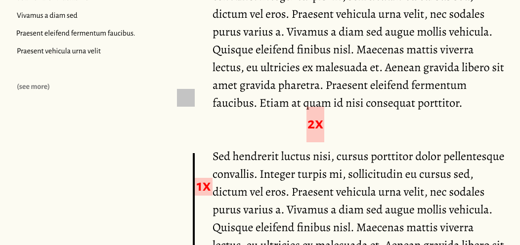
For the time being, we’ll keep our vertical rhythm super simple. First, we’ll remove all top and bottom margins - I’ve chosen to do this in my base stylesheet rather than just for the essays. Then we’ll set up a custom property to hold our base line-height and use that to set the line-height for all the elements in the essay container.
*,*::before,*::after {  margin-top: 0;  margin-bottom: 0;}
:root {  --base-lh: 1.5;}
.essay > * {  line-height: var(--base-lh);}
We can now use this base line-height to set margins on our headings, paragraphs and the like. We can use the lobotomized owl selector to target all elements that have something above them and add a margin equal to our line-height. For now, we’re using ems so the margins will scale with the font-size.
> * + * { margin-top: calc(1em * var(--base-lh));}We can add top-margin in the same way to other elements. By sticking with top-margin and never using margin-bottom, we have a simpler mental model for how spaces between elements are calculated: we never have to worry about margin collapsing or make a decision on whether to use top or bottom margin.
While we’re here, I also used this tto set some horizintal padding on blockquotes
blockquote { border-left: 2px solid rgba(0, 0, 0, 0.2); padding-left: calc((1em * var(--base-lh)) - 2px); font-style: italic; margin-left: 0;}Styling Headings
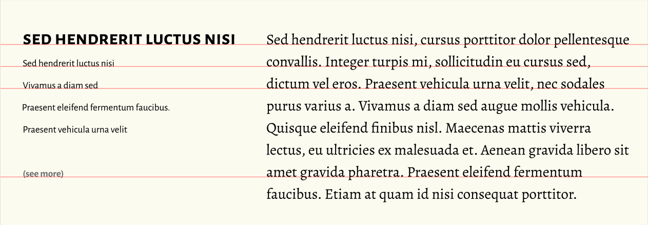
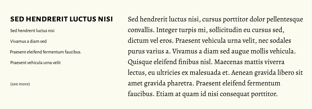
Looking through my articles I dont’t tend to use H1s very often at all, apart from as the article title. This makes sense from a semantic point of view so we can assume that all H1s inside .essay are an article title. I tend to use H2 and H3 fairly often to break my articles into sections, and H4s often appear in logner articles. I rarely, if ever use H5-6.
With this in mind, it makes sense to keep things super-simple. Here’s what I initially settled on…
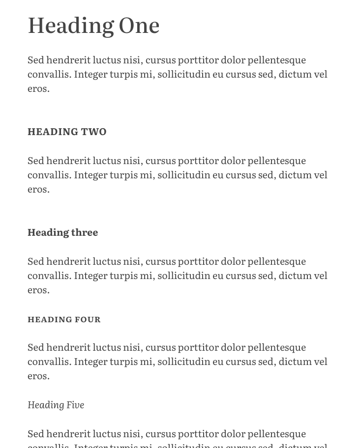
Aside from H1s, all are set at the same size as the body copy. Five and Six are styled identically in italic with the same weight and margins as paragraphs. Four is set in small-caps with a semibold weight, again with the same margin as paragraphs. Three and Two are both set in bold with a bigger top margin, two being differentiated by being uppercase.
The article title is bigger, and increases is size on larger viewports.
.essay > h1 {  font-size: 2rem;  @media (min-width: $breakpoint-m) {    font-size: 3rem;  }  font-weight: 500;  font-variation-settings: 'opsz' 50;  line-height: 1.3;}
.essay > h2 {  font-weight: bold;  text-transform: uppercase;  letter-spacing: 0.15ch;  margin-top: calc(2em * var(--base-lh));}
.essay > h3 {  font-weight: bold;  margin-top: calc(2em * var(--base-lh));}
.essay > h4 {  font-weight: 600;  text-transform: lowercase;  font-variant: small-caps;  letter-spacing: 0.05ch;}
.essay > h5,.essay > h6 {  font-weight: normal;  font-style: italic;}
I’ve also turned off styling for any links inside headings by having them inherit their styles from the heading elements.
h1,h2,h3,h4,h5 { a, a:visited, a:hover, a:active { color: inherit; text-decoration: inherit; }}I’m generally pretty happy with this, except for one thing. I use level two headings more than any other and because I’ve set them in uppercase I’m missing out on the loveley discretionary ligatures that Literata includes. So I might want to revisit this soon.