Website Redesign Part II - Principles, Goals and Stuff to Keep
Until now, every time I’ve redesigned this website it’s been because I didn’t like how it looked. Every few years, I’ve looked at it and felt like it doesn’t adequately represent me.
When I started this redesign process, I fully expected to feel the same way. But having spent a bunch of time staring at it, I think I still like a lot of what I have.
More accurately, I still really like these two pages…
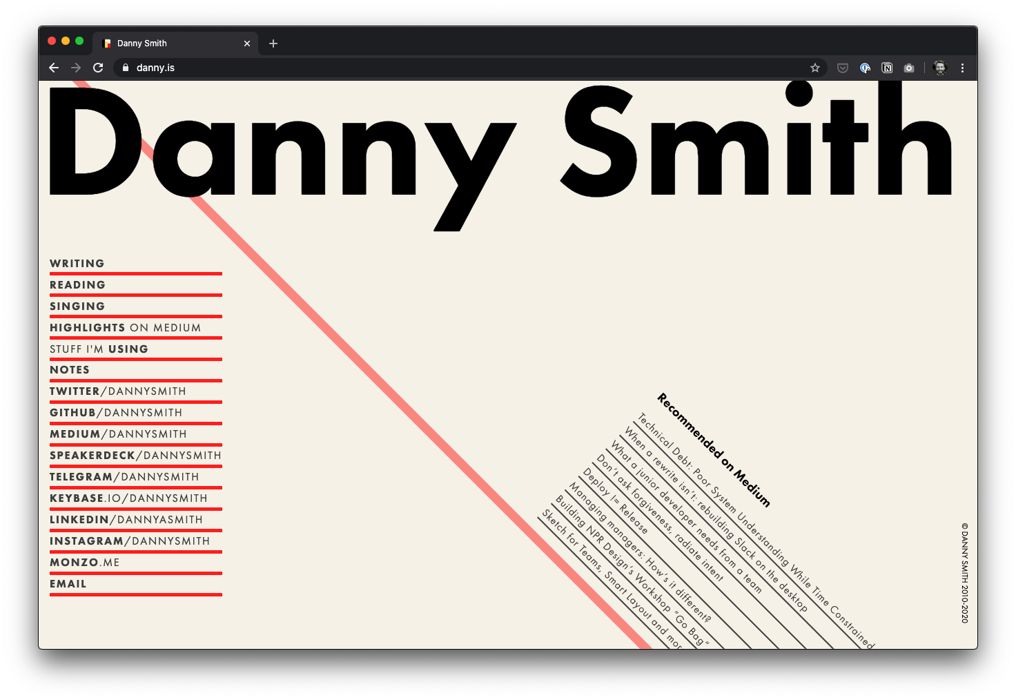
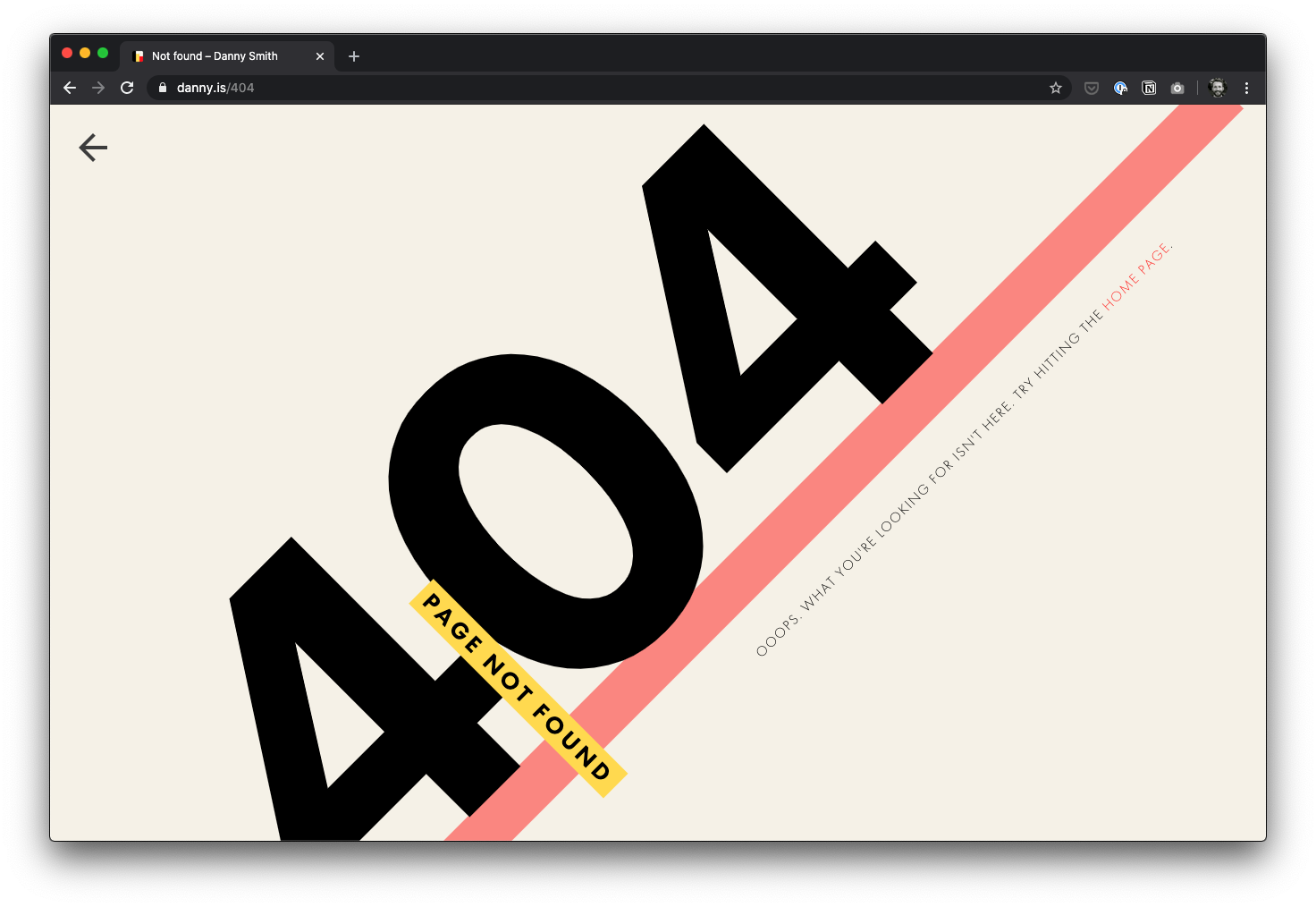
When I designed them back in 2016 I was going for a modern “Swiss” influenced kinda vibe. I think I want to keep that.
But let’s take a step back for a second and think about my goals.
Goals of this site
First and foremost, it’s a personal expression of me. It’s a place for me to have fun: both with my writing and with design & CSS. So it’s okay if it’s a bit goofy or stuff is a bit broken sometimes.
But it also represents me professionally.
Thankfully, in both cases the primary goal remains the same. To help the reader understand me – Danny.
If I put my UX hat on for a minute, there is a Job To Be Done that I should consider. A subset of visitors to this site are trying to find out if I’m the right person to help them with something.
Similarly – with my marketing and I-need-money-to-eat hat on – there is another subset of visitors that need my help; but neither of us know it yet.
The last thing I want is for my personal site to be some sort of super-optimised landing page for Danny The Professional®. Because that’s no fun. And it’s not at all an expression of me. But I do need to consider these special use cases a bit.
Of course, there are also the random folk who come here to read the stuff I write. They probably just wanna read in peace.
So if I think in terms of actors and their goals:
- Danny
- Express himself freely and without constraint.
- Have fun. With writing, design and code.
- Connect with people he can help, or who can help him.
- Interested reader
- Read Danny’s words in peace.
- (Perhaps) be notified when Danny writes some new words.
- Person checking Danny out
- Find out if Danny is the right person to help them.
- Contact Danny.
This feels like a good set of goals to start with. But they come in a strict order of priority: Danny → Interested Reader → Person Checking Danny Out. This is my personal website, after all.
So here’s a rule I’m gonna try to stick to:
Given a choice between what I want to do and what I feel I should do because [reasons], always choose the former.
Goals of this redesign
As I said in Part I, I’m doing this primarily for two reasons:
- I want a simpler, more technology-agnostic website.
- I want to write here, not on Medium.
Combined with the website goals up there ☝️, I think I’m trying to achieve the following:
- Represent myself more authentically.
- Simplify my own mental model for who I am and what I do, as expressed through this site.
- Make things more obvious and useful to readers.
- Put my writing at the front, and make it beautiful.
- Provide somewhere for folks to find out about my work, and how I might be able help them.
I suspect (2) and (3) mean better content organisation and hierarchy, along with some self-imposed constraints. (4) probably means better typography and more focus on the tiny details. As for (5) – that’s probably just a page of its own.
The first one is interesting though. I said earlier that I like the current design. For the first time ever it still feels authentic now that Redesign Time has rolled up. And so it does. At least what there is of it.
And perhaps that’s the problem. My current site is too sparse. Too sanitised. Sure, it has some wacky angles and stuff. But it has no substance.
It also feels a bit cold and unloved. Like a well-machined tool that rarely gets used.
I’d much rather it felt like a hand-made tool that’s used and loved every day. It’ll probably have more dents and scratches, but it will feel much more like home.
Representing Danny more authentically
I recently asked some friends to describe me using as many single words/short phrases as they wanted. The list so far has been a great prompt for reflection and has led me to a fair few blind spots, but I’m still waiting for a lot of folks to come back to me.
I’m hoping that this will help identify some words that I feel authentically represent me.
So where are we at?
Besides the fact that I like my current website, we’ve identified three main actors and their goals. We’ve also established five initial goals for this redesign, and expanded on the most important of them.
Back in Part I I listed four values that felt right as guides for this project.
- Simple
- Beautiful
- Authentic
- Content-first
They still feel right to me. And they now have bit more flesh on them.
What about my current website?
Before wrapping this up, I want to take a look at my current website with all this thinking in the back of my mind. I particularly want to look at the two pages I like – the homepage and the 404. Here are some unedited thoughts on them:
- They are simple. ✅
- They put the content first – even though there is hardly any of it. ✅
- There should be more content.
- I think the 404 page is beautiful. I love how the colour, type and layout interact. ✅
- The homepage is less beautiful. Futura looks pretty bad at very large sizes and the whole thing feels slightly unpolished somehow. It lacks attention to the little details. Inauthentic.
- Futura is a lazy choice of typeface - I use it everywhere.
- The 404 page feels like an authentic representation of me1. The homepage less so. This might have more to do with the content than the deign. I talk a lot and am generally friendly, and it feels a bit too minimalist and impersonal. It’s somehow not goofy enough, where the 404 page is. At least the palette feels warm ad cosy.
- I’m going for a kinda Bauhaus/Swiss vibe but there’s no grid. I’m a massive nerd for orderly systems and grids, so this feels both inauthentic and like a missed opportunity to create some beauty through mathematics.
Until next time.
Footnotes
-
Yes I know, “Not Found”. 🙃 ↩