A Simpler Responsive Grid

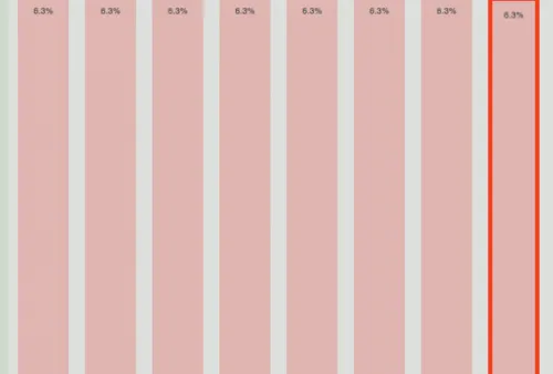
After making use of various complicated CSS grid systems, I’ve been using a simple percentage-based grid for the last year or so. It’s based on a 1000 pixel wide container with 63 pixel columns and 20 pixel gutters. The outside gutters at the extreme left/right are 12 pixels to produce a nice round number.
By using a 1000 pixel wide container, the maths is easy when using percentages. each column is 6.3%, gutters are 2% and so on…
By setting a width on the container of 100% and a max-width of 1000 pixels, and thereafter using percentages for all widths, everything resizes nicely:
#container {    margin: 0 auto;    max-width: 1000px;    width: 100%;  }
  #my-box {    width: 14.6% /* Two columns wide - (2 * 6.3)+2 */    margin-left: 1.2% /* Covering the first two columns */  }
I’ve knocked together a quick example page (code) that shows the columns. One problem with percentage-based widths is that because of the box model, any borders or padding will be added onto outside of the box. Obviously this can be a drama if you’re using pixels to declare your borders and padding.
The easy solution to this is the box-sizing property:
#my-other-box {    width: 31.2% /* Four columns wide */    margin-left: 9.5% /* Covering columns 2 to 5 (1.2 + 6.3 + 2) */
    box-sizing: border-box;    border: 2px solid red; /* will be rendered inside the box */  }
Although this property isn’t supported in IE7 and below, it’s a useful way to control the box model and make responsive design easier.